an award-nominated master’s design thesis that uses neurodesign to reimagine hospital food systems as therapeutic, sustainable, and human-centered — restoring dignity and supporting healing for both people and the planet they live in.
my role
UX/UI designer, research,
systems thinker (solo master's capstone)
timeline
august - december 2025
tools
Figma, prototyping tools, Loveable,
Mural/Miro for synthesis,
academic and industry research
↦ “Let food be thy medicine and medicine be thy food."
-Hippocrates
↦ background
the problem
Hospital food systems are failing - not in isolated moments, but systematically. Across the country, patients routinely leave meals untouched, a visible symptom of feeling unseen and undervalued (Abiad et al., 2025). These aren’t trivial moments; they often occur during the most vulnerable stages of recovery - after surgery, during chronic illness, or following a new diagnosis - when nourishment is both biological and emotional medicine.
When food goes uneaten, the consequences multiply. Uneaten meals become waste, driving up costs, burdening staff, and undermining sustainability goals. The U.S. healthcare sector contributes nearly 10% of the nation’s greenhouse gas emissions, and 10–15% of hospital waste comes from food (Practice Greenhealth, 2025). Studies estimate that over 30% of meals served in hospitals end up as plate waste (Abiad et al., 2025).
Hospitals lose money, staff morale declines, and patients miss one of their few sensory experiences of comfort and control. Food, arguably the most human expression of care, has been treated more as a logistical service rather than an act of healing.
context
Women’s hospitals sit at a powerful intersection of medicine, emotion, and design. Nutrition here is not just “recovery fuel” - it’s a determinant of maternal health, hormonal balance, and cognitive well-being through the gut–brain axis. Dietary patterns directly influence neuroplasticity, emotional regulation, and hormonal stability (Cryan & Dinan, 2019; Merlo et al., 2024). Yet many hospital food systems ignore this connection. Patients are handed menus that are confusing, overly complex, or misaligned with their cultural, medical, or emotional needs. This lack of personalization contributes to both waste and dissatisfaction (Dall’Oglio et al., 2015; McCray et al., 2018).
For women recovering from childbirth, surgery, or menopause, food is not neutral - it can either soothe or overwhelm. When hospital systems overlook hormonal shifts, digestive sensitivities, and emotional vulnerability, food becomes another stressor rather than a tool for healing (Andrist, 1997; Holingue et al., 2020).
cultural + identity disparties
Women’s hospitals do not exist in a vacuum. They operate within a broader landscape where women, queer, and gender-diverse patients have historically received inconsistent, delayed, or dismissive care. These disparities are not incidental - they are design failures baked into the systems patients must navigate. Research shows that women’s symptoms are more likely to be minimized, doubted, or under-treated compared to men’s, especially during pain, recovery, and periods of hormonal vulnerability (Hoffmann & Tarzian, 2001). Queer and transgender patients face additional layers of exclusion. In the largest national study of transgender health experiences, one-third of respondents who had seen a provider in the past year reported negative interactions in medical settings (James et al., 2016). These patterns accrue over time, shaping how safe or unsafe a clinical environment feels long before a meal ever reaches the bedside.
Food becomes part of this emotional equation. A meal that reflects cultural norms, sensory needs, religious restrictions, or identity-specific care expectations can communicate respect and welcome. By naming these disparities upfront, the path forward becomes clearer: redesigning hospital food systems is not only about improving meals. It is about repairing trust, reinforcing dignity, and creating environments where every patient feels supported through both biology and identity.
relevance
Many hospitals and nursing homes collectively waste enormous amounts of food, driving up costs and contributing to unnecessary environmental harm (Practice Greenhealth, 2025; Abiad et al., 2025). Meanwhile, dietitians, caregivers, and administrators often work in silos, with little visibility into how nutrition, satisfaction, and sustainability intersect.
Although targeted interventions - such as standardized meal sizes - can reduce inpatient food waste (Patil et al., 2023), few hospitals have systems capable of sustaining those gains long-term. The absence of connected data and design integration has turned one of healthcare’s most essential human experiences into one of its least optimized systems.
the problem itself
Hospital food systems, including those in women’s hospitals, fail to integrate patient dignity, nutritional science, sustainability, and behavioral design. These dimensions should naturally reinforce one another, yet they remain fragmented. The result is predictable: patients feel disempowered; staff lack actionable insight; and hospitals waste critical resources.
In women’s hospitals, this fragmentation is amplified by sex-specific nutritional needs tied to hormonal health, pregnancy, menopause, and reproductive recovery. Patients often experience appetite fluctuations, nausea, and emotional vulnerability, yet food remains treated as logistics, not care (Balmori et al., 2022; McGregor, 2020).
There is an urgent need for a redesigned food system - one grounded in neurodesign and user-centered design - that restores personalization, reduces waste, and reconnects nourishment to healing.
current + desired states
In their current form, hospital food systems prioritize operations over empathy. Trays, menus, and schedules dominate, while patients disengage from meals they neither want nor understand. Staff lack tools for real-time oversight, and administrators lack data that connect cost, sustainability, and satisfaction. Many existing digital tools overlook behavioral science and neurodesign, resulting in interfaces that feel static, overwhelming, or emotionally flat (Coiera et al., 2016).
However, this can change. A redesigned model reframes food as care, not service. It restores dignity through simplified, personalized choices; applies neurodesign to reduce anxiety and encourage healthier decisions (Bridger, 2017; Stanford Design Lab, 2019; Sakula, 2024); and aligns medical, nutritional, and sustainability goals through clear, interconnected data flows. In this model, food becomes both a therapeutic and environmental intervention - healing the patient and the planet together.
research intentions
This research explores how a multi-dashboard framework can bridge patients, caregivers, and administrators, turning food from a passive service into an active contributor to healing. The central question is both ethical and practical: How can we heal people without harming the systems that sustain them? If healthcare is to model empathy, it must also model sustainability.
Drawing from literature across health technology, neuroscience, behavioral science, and sustainability - along with firsthand insights from interviews with professionals - this project applies human-centered design as a method for systems-level healing. Neurodesign provides the sensory foundation; behavioral design offers the psychological insight; and sustainability ensures the outcomes endure. Together, these dimensions transform food into a living design system that nourishes recovery while reinforcing environmental stewardship.
scope & terminology clarification
While this project initially aimed to address all hospital food systems, its scope has been intentionally narrowed to women’s hospitals - environments where sex-specific nutrition and emotional care are integral to treatment. These settings offer a rich testbed for exploring how design can align biological, psychological, and sustainable forms of care.
This project is sex-nuanced, not gender-specific. In this context, “sex-nuanced” refers to design considerations tied to biological and physiological needs associated with female reproductive systems - such as hormonal cycles, pregnancy, menopause, iron deficiency, and post-surgical recovery (Balmori et al., 2022; McGregor, 2020). This framing grounds the research in science while maintaining inclusion for patients who may identify as nonbinary, transgender, or gender-diverse but receive care based on these physiological realities.
By clarifying this distinction, the project remains scientifically accurate, ethically sensitive, and inclusive - centering design where biology, emotion, and sustainability converge.
↦ research & insights
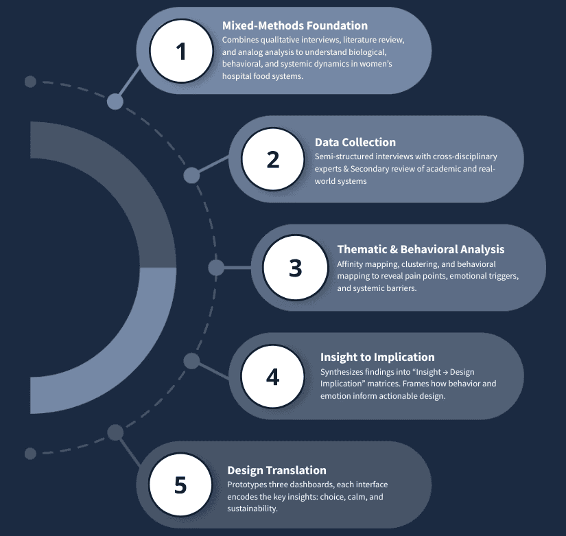
the mix
My research framework uses a mixed-methods design and is grounded in both lived experience and evidence. It is important to me to demonstrate a rich, in-depth research process to allow a level of expertise on the subject matter and get a feel for the landscape, before I go into prototyping.
My research pulled from multiple lenses - literature, interviews, and environmental analysis - to build a more human picture of hospital food systems. Each layer revealed a piece of the same truth: hospitals don’t fail to feed people because they lack nutrition; they fail because they lack connection.
Across every conversation and paper, the message was consistent: food isn’t just a logistical need; it’s a design opportunity. When treated as therapy rather than task, it becomes a medium for healing, emotion, and even sustainability. Below, you can see visually this research process:
Figure 1. How the Research Progressed from Data Gathering to Design.
My research revealed that the real issue isn’t only what we serve, but how we serve it. Systems designed for logistics instead of healing fail to nourish either the body or the environment. In other words, the system doesn’t fail for lack of nutrients; it fails when it’s designed for process, not people.
This isn’t simply a patient experience problem - it’s a systemic design failure. Food is treated as a transaction rather than a healing opportunity. Hospitals lose money through waste; staff face workflow friction; and patients lose trust. The outcomes are both material (plate waste, cost) and emotional (frustration, anxiety, loss of dignity). The goal, then, is to reimagine how food can restore control and comfort, not as an abstract promise but as a concrete design strategy.
But, those goals don’t have to compete! Hospitals sit at a powerful intersection, balancing patient satisfaction (which ties directly to funding and outcomes) with the need to lower costs and reduce waste. They are, by nature, spaces meant for recovery, yet they remain some of the largest institutional contributors to food waste and environmental strain. The contradiction between healing individuals and harming ecosystems defines the problem I’m working to solve - and the design opportunity within it.
To understand how these breakdowns play out across real hospital systems, I turned to the people working inside them - clinicians, designers, researchers, and innovators - to see where empathy and operations collide.
primary research insights (interviews)
I conducted semi-structured interviews with industry experts across a cross-disciplinary group: critical care nursing, UX/service design, administration, and behavioral strategy. These were conducted near the beginning of the project's genesis, and continued throughout the months of development.
Each brought a different lens - executive, clinical, innovation, and research - to the same question: how can hospital food become a vehicle for dignity, healing, and sustainability?
Their perspectives helped me connect the dots between empathy and feasibility, between patient emotion and system design. Together, these voices grounded the literature in lived experience and shaped the design decisions that followed.
michael kaushansky (head of growth & strategy @ HC9 ventures)
the health innovation & food-as-medicine expert (systems lens)
Michael brought a broad, strategic lens - one shaped by his work leading Blue Cross Blue Shield of Arizona’s Food-as-Medicine initiative and now in health innovation and venture strategy. He saw my project as “a really great idea,” calling it rare to see neuroscience, nutrition, and emotion integrated into one framework.
“Most Food-as-Medicine programs stop at the body. You’re asking how it affects the mind - and that’s where the real opportunity is.”
He emphasized that hospitals already know food is therapeutic, but they don’t yet have the data - or the design systems - to prove it’s worth investing in. He urged me to think like a strategist: measure what matters and design for integration, not disruption. Hospitals, he explained, are risk-averse ecosystems. They will only adopt change if it fits within existing workflows and software systems (like Epic) and produces visible ROI - less waste, faster recovery, higher satisfaction, lower cost.
Michael’s biggest contribution was strategic realism: he reminded me that design has to make adoption feel doable. He reframed my framework not as a replacement for hospital infrastructure, but as an enhancement - something that quietly improves emotional and operational design without demanding structural overhaul.
Design implications:
Prioritize integration over reinvention; align dashboard functions with Epic and existing FAM data streams.
Focus pilot testing on one clearly defined population to prove measurable ROI quickly.
Capture and visualize emotional outcomes (trust, satisfaction) alongside operational ones (waste, intake, cost).
Add clinical outcome metrics (A1c, NICU rates, depression indicators).
vanessa lewin (corporate relations & market partner @ the american orthopedic association)
corporate relations & healthcare marketing (executive lens)
Vanessa brought an executive, communications-driven perspective grounded in years of work with medical societies and hospital partners. She immediately reframed my challenge: no matter how meaningful the mission, adoption depends on alignment with organizational goals.
“It’s going to be all about the money... but that doesn’t mean you lose the mission. You connect people with data.”
Vanessa emphasized that successful innovation in healthcare requires balancing mission and metrics. Executives want to see financial efficiency, waste reduction, and measurable patient outcomes. She recommended that I lead with compassion but prove with numbers - connecting dignity, empathy, and comfort directly to quantifiable ROI. She also underscored the importance of internal champions - someone inside the hospital who can advocate for the project and help navigate food-service contracts and vendor partnerships, which are often long-term and difficult to change.
Beyond logistics, Vanessa resonated with the emotional power of food in care, particularly in pediatric and women’s hospitals. She described food as both a moment of control and comfort, framing it as an untapped opportunity for emotional marketing and patient trust. Our conversation turned philosophical toward the end. She asked, “What’s the best feeling in the world?” She said hers was relief. I said comfort. That moment reframed my own design values - to build for comfort, not just convenience - and reminded me that emotional resonance is a legitimate design goal in healthcare.
Design implications:
Frame sustainability and patient dignity as measurable value propositions tied to cost and satisfaction.
Use comfort as a guiding design principle in the patient interface.
Identify and partner with internal advocates early for smoother adoption.
Integrate ESG and patient-satisfaction metrics to connect ethical care to financial sustainability.
alexis attinoto (research publications coordinator @ northwestern memorial hospital)
clinical communication, patient and hospital background (clinical lens)
Alexis offered a frontline perspective grounded in both clinical nutrition and patient advocacy. She described my project as “something we’ve needed for a long time,” highlighting how nutrition, emotion, and workflow all collide in hospital life.
“If you can make eating feel safe again, you’ve already won half the battle.”
She confirmed that hospital systems are deeply fragmented. Dietitians, nurses, and kitchen teams all use separate systems that rarely communicate. Waste data lives in spreadsheets no one reads; patient satisfaction data is siloed in post-discharge surveys; and emotional feedback - the sighs, tears, and gratitude that accompany meals - never feels truly captured.
Alexis validated my focus on choice and emotional design. She shared that small acts of autonomy, like allowing patients to order food when hungry instead of on schedule, improve both appetite and dignity. She described food as emotional medicine - “a form of comfort, identity, and normalcy.” She also emphasized staff well-being, reminding me that any system that adds steps to a nurse’s workflow is destined to fail, no matter how noble. Her insights helped me reimagine empathy not just for patients but for caregivers. A healing system must also feel humane for the people who deliver it.
Design implications:
Design a unified dashboard linking patient experience, waste, and cost metrics.
Use sensory design (calm color, clear hierarchy, soft tone) to make eating feel emotionally safe.
Reduce friction for caregivers; design empathy into the workflow, not just the interface.
Prototype pilot programs in women’s hospital units to measure small wins before scaling.
Highlight women’s and queer health insights as a core equity focus
heidy cabral (clinical research coordinator @ brigham and women’s hospital)
clinical research coordinator, patient experience studies (research lens)
My conversation with Heidy was both professional and personal. We first met years ago at an undergraduate part-time job, and reconnecting now - as two people who had navigated from creative chaos to clinical research - made the dialogue deeply candid. Heidy works in gastroenterology research, focusing on the gut-brain axis and microbiome therapies like fecal microbiota transplants. She immediately understood my interest in connecting neurodesign, nutrition, and cognition.
“Food is very important, we see a lot of patients not enjoying what they’re eating, and it’s such a big part of GI.”
She confirmed that hospital food data is rarely tracked beyond basic diet type - which is an enormous design gap. The lack of integration between nutrition records, patient feedback, and clinical data means no one can see how food actually affects recovery. Heidy supported my idea of a modular “fast-casual” model - bulk-prepared ingredients combined in flexible, diet-safe ways - calling it “a great idea” that could make personalization feasible without inflating costs. She also highlighted bureaucratic and contractual constraints, urging me to design within existing systems (especially Epic) rather than outside them.
Beyond the practicalities, she touched on empathy and narrative medicine, arguing that conversation itself is a healing act. Her words reminded me that emotional safety starts with tone - how we communicate care, not just deliver it.
Design implications:
Embed personalization through modular food options that balance cost and autonomy.
Design Epic-compatible nutrition dashboards linking intake, waste, and emotional data.
Frame patient communication around dialogue and story, not instruction - bridging design and narrative medicine.
Position sustainability as both environmental and emotional - sustaining staff and systems as much as resources.
secondary research insights (literature review & patient discourse)
In addition to interviews, I conducted a literature review that synthesized findings from nutrition science, neuroscience, UX/neurodesign, and sustainability. I also reviewed existing hospital nutrition and food management tools to understand current capabilities and integration gaps with EHR systems like Epic.
Finally, I briefly explored patient perspectives shared in publicly available online forums as a form of field study, to understand lived experiences with hospital food. These posts weren’t treated as data but as context, a reminder that the feelings behind the numbers matter too.
literature review
For this literature review, I drew on academic research, clinical evidence, and industry perspectives to understand hospital food through behavioral, environmental, and emotional lenses. The aim wasn’t to summarize everything but to map how these disciplines intersect in real care experiences. The arc moves from problem definition to biological and behavioral roots, to sustainability, and finally to how technology and design can drive change. Threaded throughout is neurodesign: the idea that how people think, feel, and heal is inseparable from the systems and environments around them (Bridger, 2017; Stanford Design Lab, 2019; Sakula, 2024).
story flow snapshot
the problem: hospital food systems and patient experience
Hospital meals are more than a logistical checkbox. They’re one of the few predictable moments in a patient’s day — and when they fall short, patients feel it. Low personalization, rigid timing, and weak feedback loops often turn food into a source of frustration rather than comfort, reinforcing a sense of restriction at a moment when autonomy is already limited (Dall’Oglio et al., 2015). What should be nourishment becomes another reminder that care is happening to patients, not with them.
This disconnect matters because food experience is inseparable from patient experience. Research consistently shows that food quality, presentation, and delivery shape how patients perceive dignity, empathy, and overall care, with satisfaction influencing both recovery engagement and institutional performance metrics (Dall’Oglio et al., 2015; Centers for Medicare & Medicaid Services, 2025). When meals are misaligned with appetite, symptoms, or cultural preference, intake drops and waste rises — not because patients are ungrateful, but because the system is poorly tuned to human rhythms.
At its core, this is a design problem. Service models that return choice and timing to patients improve intake, reduce waste, and strengthen feelings of participation in care (McCray et al., 2018). Reframing hospital food as a patient experience — not just an operational task — opens the door to systems that support healing, dignity, and stewardship at the same time.
the impact: nutrition, cognition, + food as medicine
Nutrition shapes far more than physical recovery. Through the gut–brain axis, what patients eat influences mood, cognition, stress response, and emotional resilience — positioning food as both biological fuel and a behavioral intervention (Cryan et al., 2019). Research across neuroscience, psychology, and clinical nutrition consistently shows that diet affects how people think, feel, and engage with care. In hospital settings, where appetite fluctuates and cognitive load is already high, food becomes part of treatment whether we design it that way or not.
This impact is especially pronounced in women’s health. Sex-specific differences in immune response, stress regulation, and cognition mean that nutrition plays a uniquely critical role in recovery and resilience (Holingue et al., 2020; Balmori et al., 2022). Food-as-Medicine research further reinforces this connection: when patients have access to supportive nutrition and guidance, engagement improves long before biomarkers do (Berkowitz et al., 2018; Doyle et al., 2024). Taken together, the evidence makes a clear design case — if food influences brains, behavior, and healing, then hospital meal systems are not ancillary services. They are part of care.
the responsibility: sustainability in healthcare
Hospitals exist to heal, yet they are also among the largest institutional producers of food waste. That contradiction sits at the heart of healthcare sustainability. Food waste reflects more than inefficiency; it exposes a misalignment between mission and impact. Research shows that hospital food systems affect every stage of environmental harm — from sourcing and preparation to disposal — making them powerful leverage points for change (Carino et al., 2020). When nearly a million patients occupy hospital beds daily, even small design improvements ripple outward at scale.
Sustainability in healthcare is not just an operational concern, but an ethical one. Studies consistently show that increasing patient choice, improving timing, and tightening feedback loops reduce both waste and dissatisfaction, proving that autonomy doubles as a sustainability strategy (McCray et al., 2018; Cook et al., 2023). In women’s hospitals, this responsibility carries added weight, aligning stewardship with long-standing values of care, community, and prevention (Andrist, 1997). Designing food systems that honor both patient and planet reframes sustainability as a form of care — one that nourishes people while protecting the environments that sustain health.
the solution: healthtech + behavioral design
Bridging biology, behavior, and stewardship requires more than technology alone. The opportunity sits at the intersection of healthtech, behavioral design, and human-centered UX — where data supports empathy rather than replacing it. Behavioral Design provides structure by identifying behavioral challenges and translating evidence into actionable features, while Design Thinking ensures those solutions remain intuitive, emotionally resonant, and grounded in lived experience (Voorheis et al., 2022). When paired thoughtfully, these frameworks create systems that guide action without stripping away agency.
Neurodesign strengthens this approach by accounting for cognition, emotion, and stress — especially critical in hospital environments where cognitive load is already high. Research shows that personalization, feedback, and clear affordances improve engagement and reduce friction in digital health tools (Mair et al., 2023; Norman, 2013). In women’s healthcare, this becomes even more essential. Designing systems that adapt to physiological variability rather than standardizing it away is both a scientific and ethical responsibility (McGregor, 2020). Together, these frameworks point toward a solution space where technology amplifies care, supports dignity, and closes the gap between operational efficiency and human experience.
Across nutrition science, cognitive psychology, sustainability, and design, the literature converges on one insight: when food systems respect biology, behavior, and the planet, healing becomes holistic. For women’s hospitals, this intersection is especially potent, turning nourishment into therapy and stewardship.
The path forward pairs behavioral structure with design empathy, grounded in neurodesign and sustainability, to make everyday care both humane and measurable (Voorheis et al., 2022; Mair et al., 2023; Bridger, 2017; Carino et al., 2020; Cook et al., 2023; Abiad et al., 2025).
field observation via public discourse
While peer-reviewed research quantifies hospital food systems in terms of nutrition, cost, or operational efficiency, public discourse tells and shows how it feels. Just searching “hospital food reddit” on Google, threads are immediately surfaced with titles such as “American hospital food is shameful” and “Is hospital food horrible everywhere?” - posts and entire threads filled with frustrations and small moments of resignation.
Figure 2: Sample of Reddit Threads on Hospital Food
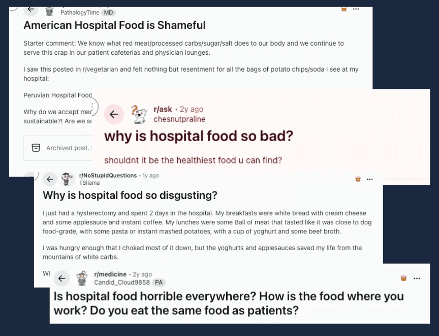
These unfiltered conversations really reveal the lived reality behind the data and that this problem is real and a conversation point: hospital food, for many patients, symbolizes neglect and a loss of dignity within the care experience. Unlike the controlled tone of institutional studies, these spaces offer raw, collective narratives that underscore how deeply food intersects with emotion, memory, and perceived value of care.
google reviews
Expanding on the advice of medical professionals who work within this landscape, it was advised to also include the tracking of patient experience through Google Reviews, as 59% of consumers rely on online search to find healthcare providers (Press Ganey, 2025).
To conduct field observations for Google Reviews, I began by researching a list of the US’s busiest hospitals, with most visits per hour (Tortorice, 2022). From that list, I analyzed specific Google Reviews from the top 5 busiest U.S. hospitals, filtering for comments mentioning “food” or “meal.” These reviews offered an unfiltered emotional snapshot of how patients interpret food as either care or neglect. From the 32 analyzed food reviews, major themes emerged across all hospitals, including: patterns of meals that ignore dietary needs; missing, incorrect or inconsistent orders; rude or dismissive food service staff; and cold, unappetizing, poor-food quality. On the other hand, there were also positive outlier. As evidence, these reviews showed that when food is good, people notice. For better clarity, these results can be viewed via the table below:
Table 1: Themes in Google Reviews Related to Food Experiences
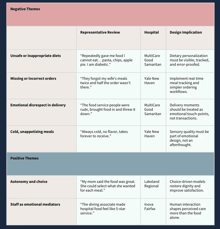
Across hospitals, the emotional patterns were strinkingly consistent: patients rarely describe food in terms of nutrients and instead describe how it made them feel. Cold trays, incorrect diets, or forgotten meals were interpreted as signs of being unseen or unimportant, while warm interactions, choice, and small moments of personalization were described as care, comfort, and even relief. With this in mind, it should be no surprise that negative review (1-2 star reviews) were correlated with negative food reports, while positive reviews (4-5 stars) were seen when food was positively reported. These reviews reinforce the same insight revealed throughout interviews and literature: food is not experienced as a service, but as a signal of dignity, coordination, and emotional safety. Public sentiment consistently frames food not as a logistical function but as a barometer of connection, agency, and care.
Together, these digital and institutional voices highlight the same message from different directions: food satisfaction is not just about nutrition or presentation, but about agency, belonging, and psychological well-being. Integrating these real-world and in-house perspectives reinforces that the “problem” of hospital food is as human as it is logistical, and any sustainable redesign must respond to both.
affinity mapping & thematic synthesis
The literature underscored a simple but radical truth: food is medicine, and sustainability is care. Studies by Doyle et al. (2024) and Cryan et al. (2019) showed that nutrition directly shapes cognition, emotion, and recovery, while Carino et al. (2020) and Cook et al. (2023) revealed how hospital food systems influence every link in the environmental chain, from procurement to waste. Together, they reframed how I think about nourishment and design. If food shapes both the brain and the planet, then building sustainable, behaviorally informed food systems is a form of holistic healing.
The same principles that define empathy in human care - nourishment, feedback, validation, choice, and dignity - can also restore the ecosystems that sustain us. This is where neurodesign and behavioral design meet sustainability: creating food systems that feel better, function smarter, and do less harm.
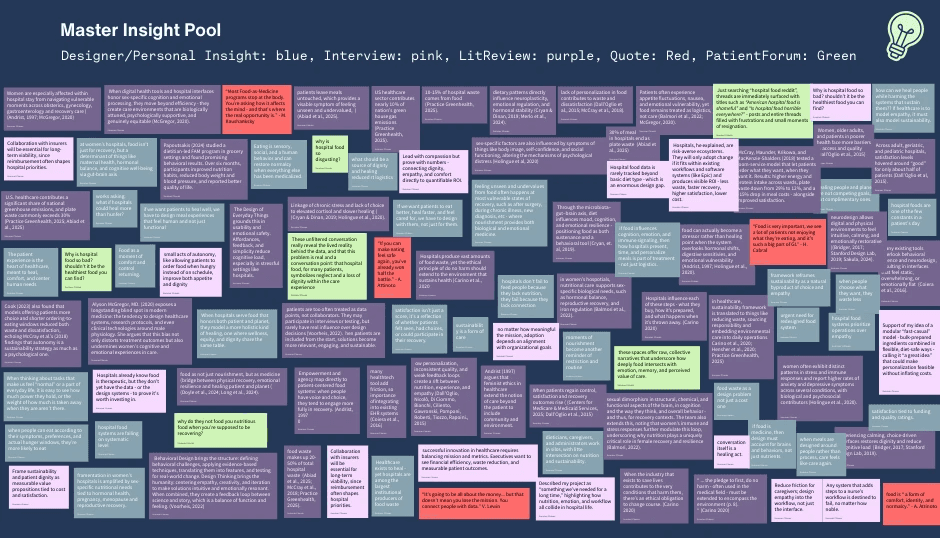
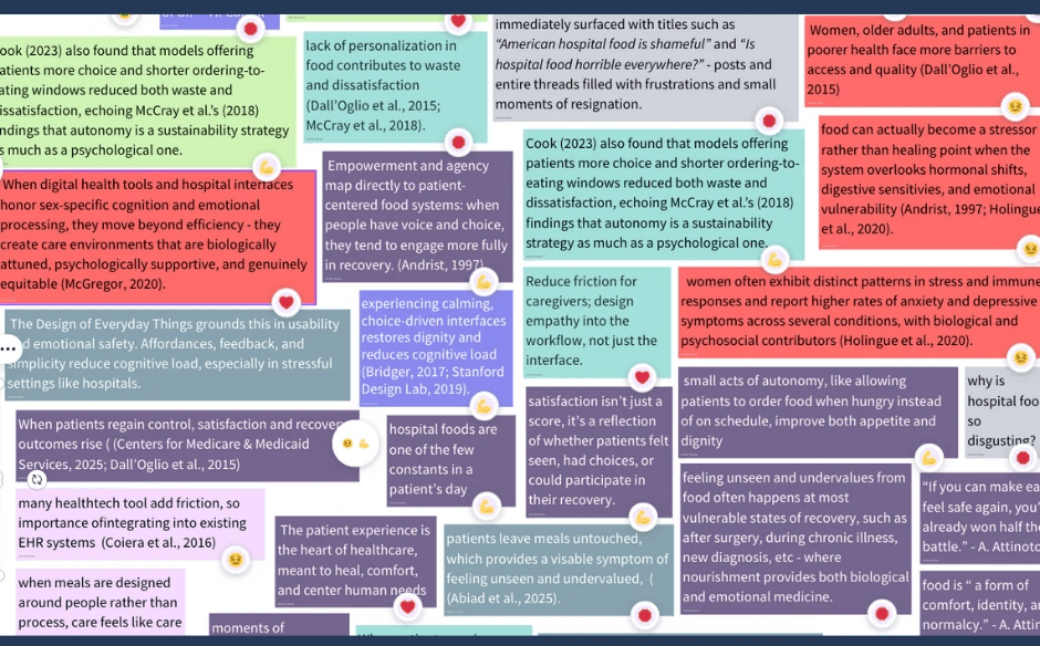
To synthesize qualitative data, I imported all interview excerpts, literature themes, field observations, and contextual notes into Canva Whiteboard. Each insight was coded by color and grouped into clusters reflecting emotional, behavioral, and operational dimensions. The resulting affinity map revealed repeating intersections, such where empathy, workflow, and sustainability collided, which became the four emergent themes below.
Figure 3: Master Insight Pool of Notes from Interview, Literature, Observations and Notes
emerging themes
This phase of analysis moved from pattern recognition to meaning-making. What began as dozens of individual quotes, notes, and reflections eventually converged into four key themes, each representing a layer of the same truth: food is never just food. It’s emotional, behavioral, systemic, and ecological all at once.
Together, these themes illustrate how nourishment can serve as a form of medicine, feedback, and connection. The connectors - Food as Medicine, Gut–Brain Axis, Sex-Specific Care & Hormonal Recovery, Patient Forum Emotions, and Empathy Loops - act like bridges between them, showing how each dimension of care influences the others. Below, this visual clustering illustrates how empathy and dignity consistently emerged as central design anchors.
Figure 4: Diagram of Thematic Clusters Paired with “Connectors” between Themes
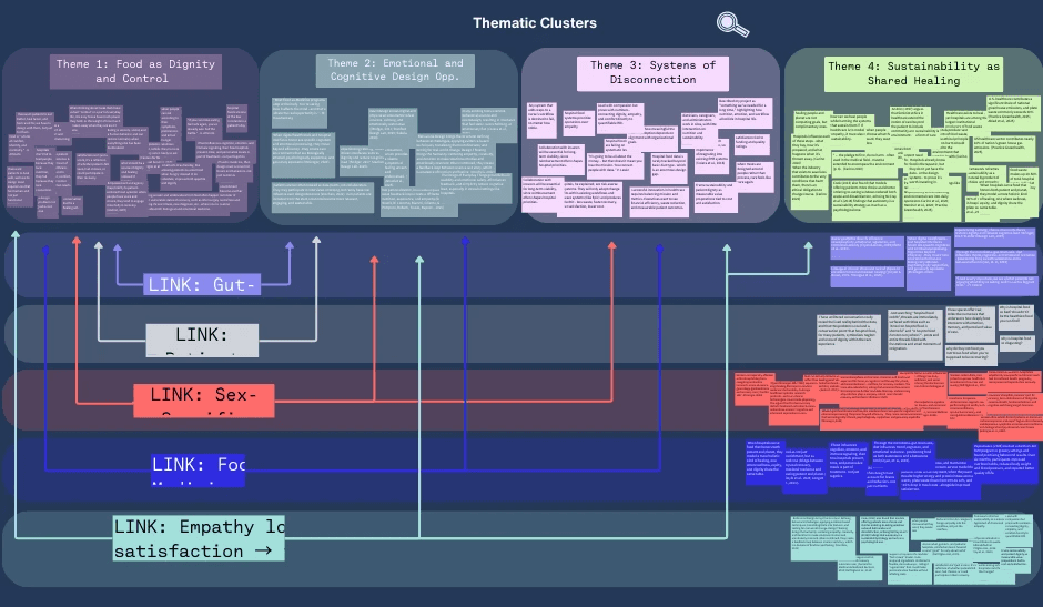
For each thematic cluster, a little more context, insight and design implications are explored:
1. food as dignity and control
Food is often one of the last remaining choices a patient can make during their stay. It’s personal, sensory, and deeply human - a quiet form of self-expression that becomes especially meaningful when everything else feels clinical or out of reach.
Insight: When patients regain even small forms of control - choosing what and when to eat - satisfaction, trust, and recovery outcomes rise. Choice doesn’t just increase intake; it restores a sense of normalcy and belonging.
Why it Matters: Losing autonomy during illness can quietly erode motivation and identity. In this context, design becomes a tool for restoring dignity. The way a meal is presented or a choice is framed can be as therapeutic as the nutrients themselves.
Design implications:
Build meal systems around guided autonomy: flexible choice within safe parameters.
Treat ordering interfaces, menus, and signage as emotional touchpoints, not transactions.
Close the loop: let patients see how their choices affect satisfaction or waste reduction.
Reimagine food delivery moments as acts of participation, not passive service.
2. emotional and cognitive design opportunities
Neurodesign and behavioral design remind us that care doesn’t start with medicine, it starts with how a space or system makes someone feel. Calm, clarity, and predictability aren’t luxuries; they’re prerequisites for healing.
Insight: When digital and physical experiences are designed with emotional safety in mind (clear hierarchy, warm tone, visual calm) cognitive load drops and trust increases. Patients can focus on healing, not on navigating complexity.
Why it Matters: Hospital environments are already overstimulating. Menus, screens, and alerts often add noise instead of comfort. Good design can quiet the mind, reduce anxiety, and even lower physiological stress responses, reinforcing the biological side of recovery.
Design implication:
Apply neurodesign principles across interfaces and physical spaces (color, tone, layout).
Use behavioral cues to personalize and gently guide decisions.
Reduce cognitive friction: design predictable patterns and calm hierarchies.
Design for emotional restoration, not just efficiency.
3. systems of disconnection
Hospitals don’t fail to feed people because they lack nutrition; they fail because they lack connection. Across departments, nutrition, sustainability, and patient experience operate in silos, producing inefficiency and emotional distance.
Insight: Empathy can’t thrive in fragmented systems. When dietitians, caregivers, and administrators are separated by workflow and data gaps, human needs become logistical afterthoughts.
Why it Matters: Innovation dies where systems stop communicating. A hospital’s ability to feed, heal, and sustain depends on how well it connects human experience with operational logic.
Design implication:
Develop integrated dashboards linking satisfaction, nutrition, and waste data.
Align EHR systems and caregiver workflows to minimize friction and duplication.
Frame empathy and sustainability as shared metrics - both improve ROI and care quality.
Use systems mapping to expose misalignments and visualize opportunities for connection.
4. sustainability as shared healing
Healing the patient and healing the planet are not competing goals - they’re parallel responsibilities! When empathy extends beyond the patient to include the environment, care becomes circular.
Insight: Food waste isn’t just a cost issue; it’s a reflection of emotional and operational neglect. When patients have real choice and feel connected to their meals, waste decreases naturally - linking empathy to measurable environmental benefit.
Why it Matters: The healthcare industry contributes nearly 10% of the nation’s greenhouse gas emissions. Reducing waste, sourcing responsibly, and designing sustainably are not just ethical acts; they’re extensions of the same promise to “do no harm.”
Design implication:
Use choice-based models (room-service or modular formats) to reduce waste and cost.
Visualize real-time sustainability metrics for both patients and administrators.
Reframe sustainability as an emotional outcome: care that heals without harm.
Embed environmental literacy into patient-facing experiences (“your meal choice saved X lbs of waste”).
connecting the dots
These four themes aren’t isolated; they work together like a living ecosystem. Each connector helps translate research into design rationale, showing how small emotional moments can ripple across systems and scales (see Figure 4 above).
Patient Forum Emotions (Reddit): The human mirror - raw, unfiltered accounts of frustration, shame, and longing for dignity. This connector links Theme 1 and Theme 2 by grounding design in the emotional reality of patients who feel unseen.
Gut–Brain Axis: The biological bridge between what we eat and how we feel. It links Theme 1’s emotional control with Theme 2’s neurodesign principles, showing that stress reduction and sensory calm are forms of medicine too.
Sex-Specific Care & Hormonal Recovery: A reminder that one-size-fits-all design is often one-size-fits-male. This connector joins Theme 1, Theme 2, and Theme 3, highlighting the biological and systemic inequities that influence recovery and emotional health in women’s hospitals.
Food as Medicine: This connector anchors the entire framework. It ties together nourishment, emotion, and environment - turning “food” from a hospital service into a therapeutic system (Theme 1, Theme 2, and Theme 4). When food is treated as care, patients heal faster, waste less, and feel more seen.
Empathy Loops (choice → satisfaction → trust → sustainability): The feedback loop that holds everything together. When patients have choice, satisfaction grows. When satisfaction grows, trust follows. And when trust exists, sustainability becomes not just possible - but inevitable.
In short: each theme reflects a different scale of healing, from the individual plate to the planet. Designing for one dimension alone isn’t enough. But when dignity, emotion, systems, and sustainability intersect, care becomes more than a process, it becomes a relationship.
behavioral mapping
To translate the thematic insights into human behavior, I re-coded the master insight pool using four behavioral states -empowerment, care and empathy, overload, and disengagement. Each represents a distinct moment in the patient or system journey, capturing how emotions, choices, and environmental cues influence recovery and participation.
Figure 5: Emoji Labeling Glimpse from Behavioral Mapping
💪 empowerment: Moments coded as empowerment appeared when patients regained even partial control - choosing what to eat, when to eat, or being invited into the design process. Autonomy consistently predicted better emotional outcomes, from satisfaction to reduced waste. Empowerment wasn’t just about options; it was about being trusted with choice. As several sources showed (Andrist, 1997; McCray et al., 2018), when people have agency, recovery becomes participatory rather than passive.
Behavioral pattern: Empowerment → engagement → trust → sustained improvement.
❤️ care and empathy: Heart-coded insights captured moments of genuine connection - when patients felt seen, heard, or nurtured through design or interpersonal care. These appeared most often in notes about emotional safety, intuitive design, and food as comfort. Even seemingly small acts of empathy (a warm tone, predictable rhythm, or a meal that felt familiar) carried outsized behavioral influence, restoring calm and cognitive ease (Bridger, 2017; Stanford Design Lab, 2019).
Behavioral pattern: Empathy → emotional regulation → comfort → adherence.
😖 overload and friction: Confused-face notes represented cognitive and sensory overload: too many steps, too much choice, or interfaces that felt overwhelming. These were often linked to friction in digital health tools, disconnected workflows, or hospital environments that prioritize efficiency over experience. Overload disrupted trust and reduced follow-through, reinforcing the behavioral science evidence that cognitive simplicity drives engagement (Voorheis, 2022; Coiera et al., 2016).
Behavioral pattern: Overload → frustration → avoidance → disengagement.
🛑 disengagement: Stop-coded notes highlighted moments of emotional withdrawal - when patients stopped trying to engage or expressed resignation (“hospital food is shameful,” “why is it always bad?”). These comments reflected learned helplessness within systems that deny agency and empathy. Disengagement signals a deeper behavioral failure: the absence of perceived reciprocity between effort and care. Re-engagement begins only when systems reintroduce dignity, dialogue, and small acts of control.
Behavioral pattern: Disengagement → detachment → passive compliance → decline.
insights & implications
Across all data, one insight held steady: choice is medicine.
When patients experience autonomy - even small, guided choices - anxiety decreases, trust rises, and adherence improves (McCray et al., 2018). In sex-specific care settings, these effects intensify. During postpartum recovery or hormonal transition, feelings of disempowerment are heightened. Offering simple, dignified interactions - like calm visual design, intuitive meal selection, or gentle personalization - creates a bridge between vulnerability and empowerment.
Re-grouping insights through a behavioral lens made these dynamics clearer. Patterns of overload, care, empowerment, and disengagement often existed within the same systems, shifting based on how much agency or empathy the experience offered. For example, when patients were overwhelmed by too many food options or rigid workflows, disengagement followed. But, when those choices were guided and when design balanced autonomy with clarity, trust and satisfaction increased. These findings mirror behavioral science research showing that personalization, feedback loops, and guided autonomy sustain motivation and behavior change over time (Mair et al., 2023; Voorheis et al., 2022).
Ultimately, the behavioral mapping revealed that the strongest predictor of engagement wasn’t efficiency or variety, it was emotional safety. People participate when they feel seen, not managed. Empowerment and empathy act as behavioral levers, transforming nourishment from a logistical task into a meaningful exchange of care. When patients experience design that feels human: predictable, calm, and reciprocal - their behaviors naturally align with healing.
For designers, this means the goal isn’t to add more choice, but to create choice that feels safe. Systems should minimize friction, simplify decisions, and embed empathy loops that reward participation. When care environments honor emotion and cognition equally, behavior follows, and healing becomes both behavioral and systemic.
the takeaway
My research revealed that hospital food is not just a matter of nutrition or logistics - it’s a reflection of what we believe care should feel like. Across literature, interviews, behavioral mapping, and public discourse, one truth kept resurfacing: choice is medicine. When patients are invited to participate - when they are trusted with small, guided decisions - anxiety drops, trust grows, and healing begins to feel like collaboration rather than compliance.
Through this lens, nourishment becomes more than fuel. It becomes feedback. Every menu, every bite, every interaction signals something about dignity, empathy, and belonging. When those signals are clear and compassionate, patients engage more fully, staff feel supported, and waste decreases as a natural outcome of care done well. In other words, empathy and efficiency are not opposites; they’re symbiotic.
What started as an exploration of hospital food systems evolved into something larger: a framework for neuro-sustainable care. By treating food as a multi-sensory experience that engages both the body and mind, hospitals can heal people and the planet in the same act. This means designing systems that are not just functional but emotionally intelligent - systems that calm rather than overwhelm, guide rather than dictate, and connect rather than isolate.
In the end, the most meaningful insight was also the simplest: hospitals don’t fail to feed people because they lack nutrition; they fail when they forget that food is an act of care. When we design for dignity - for comfort, for clarity, for connection -nourishment transforms from a transaction into therapy. Healing, it turns out, begins long before the first bite.
↦ the solution:
the plan (what this becomes)
I knew my next step was to translate these insights into something more tangible - a concept that treats hospital foods as both therapy and stewardship. The system I’m proposing integrates three layers into one experience:
Food-as-Medicine, powered by behavioral design: choice, gentle personalization, and feedback - all built directly into the meal system
Sustainability that’s made visible: an administrative dashboard that shows the ripple effects of better decisions, like less waste, smarter sourcing, and higher satisfaction
Neurodesign within the interface: calm visuals, humane microcopy, and pacing that reduce anxiety and restore agency during mealtime
Early on, I imagined building a brand-new platform, but after speaking with stakeholders, I’m taking a more realistic path: integrate, don’t replace. Hospitals are already stretched thin, and another tool (even a beautiful one!) can become another burden. The opportunity is to work within what exists, improving communication and interaction in subtle, meaningful ways.
the core idea:
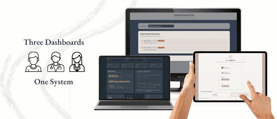
a multi-dimensional dashboard. One connected ecosystem for patients, caregivers, and administrators that treat food as care and not a commodity.
By embedding within existing EHRs and foodservice tools, the design meets healthcare teams where they already are. The challenge isn’t disruption; it’s translation - turning abstract concepts like “patient dignity” and “nutritional engagement” into measurable, visible, and actionable insights.
The goal remains the same but becomes more focused: to redefine nourishment as a multi-layered system of healing - one that connects individual recovery with planetary health. The prototype will bring this to life, showing how behavioral, neuro, and sustainability principles can coexist within one cohesive digital experience. Whether viewed on a caregiver’s tablet, a patient’s bedside display, or an administrator’s dashboard, the experience should feel consistent: empathetic, efficient, and quietly supportive. At its heart, this project isn’t about building another digital tool, it’s about restoring connection between food and feeling, between hospital and home, between healing and the world patients return to.
Figure 6: Three Faces, One System
core objective (why it matters)
What if something as ordinary as hospital food could heal more than hunger? By integrating food-as-medicine with sustainable design, the goal is to nourish people and the planet at once, through empathy, evidence and design. This isn’t just about “fixing a process”; it’s modeling the kind of balance healthcare should embody outside it’s walls.
the dashboards (three faces, one system)
My solution pairs a redesigned patient-facing meal-ordering flow with an AI-powered staff dashboard. Together they reduce waste, elevate patient dignity, and (ideally) enhance recovery by aligning nutrition more closely with medical needs and cognitive support (Coiera et al., 2025). The dashboard system has three primary faces, discussed in detail below:
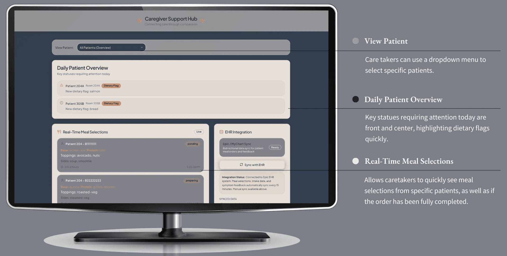
the patient dashboard: choice, calm & comfort
purpose & philosophy
As explored throughout the paper, patients are missing the key component to their meal time ordering: choice. With the patient dashboard, they have the power of ordering their meals at a touch of their button. No more confusion on what is or isn’t available to order, no lack of transparency of options, and no misguidance within ordering instructions. The power is returned to the patient, allowing them the choice and dignity to heal through nutritional food that they select.
In essence, the patient dashboard is designed around a simple idea: mealtime should feel like care, not another demand on a patient’s already limited energy. In most hospital settings, food is delivered according to logistics, a complicated menu, or a difficult phone call - all of which do not meet human needs in the time of vulnerability. Can you imagine having to communicate with a nurse on what you can or can’t eat, while you are nauseous from the pain medication and can barely stay awake? This is the time for the patient to rest and heal, and nourish their body - not apply more pressure on their cognitive load.
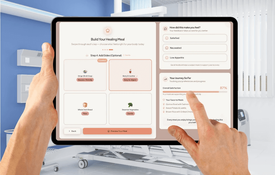
To reinforce this philosophy visually, the interface uses a warm, non-clinical color palette and a gentle, breathable layout that mirrors the emotional tone of the experience. Soft blush backgrounds, rounded surfaces, and gentle shadows create an environment that feels more like a comforting digital sanctuary than a hospital ordering system.
Overall, this interface is meant to restore a sense of agency at one of the most emotionally vulnerable points of the care experience. Instead of rigid meal rounds or overwhelming menus, patients move through a guided, gentle flow that adapts to their preferences, their symptoms, and their body’s changing needs throughout the day. And there is a heavy emphasis on nutritional food as well - as all options provided will heal both the mind and the body simultaneously, without any further work, thought or effort from the patient. The goal is not just dignity, but nourishment as well. And, to make matters even better, they have the added benefit of helping to heal the planet without even realizing it.
Figure 7: Patient Dashboard
neurodesign for healing: reducing cognitive & emotional load
The dashboard is intentionally quiet - visually, cognitively and emotionally. Through many, many rounds of iteration, every part of the interface was dissected to apply neurodesign principles to reduce stress, support intuitive decision-making, and create a sense of safety. You can see this specifically within:
Calm visuals and predictable hierarchies: The layout is simple and stable: a centered meal-builder card, supportive modules on the right, and clear “next steps.” Predictable spatial patterns reduce anxiety by giving patients a sense of orientation and control. Soft blushes and warm neutrals reduce sympathetic activation and help patients feel grounded. Nothing sharp, nothing clinical, nothing overstimulating. The palette was chosen to feel like a quiet exhale. More specifically, this predictability is supported by a soft, low-contrast color system - warm blushes, creams, and peach highlights - chosen because warm neutrals are shown to lower cognitive arousal and improve emotional regulation.
Figure 8: Patient Dashboard Color Palette

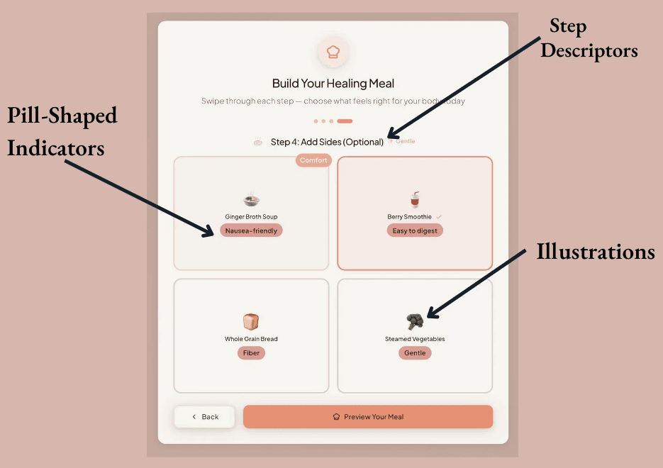
Reduced cognitive load through chunking: Each screen shows only a small set of choices - a base, then a protein, then toppings, then gentle sides. This “chunking” strategy supports patients who may be fatigued, in pain, or cognitively foggy. Every category card follows the same structure: centered illustration, short label, and a gentle pill tag such as “Healthy Fat,” “Vitamin A,” or “Nausea-Friendly,” which reduces the cognitive effort of interpreting dietary benefits.
Figure 9: Patient Dashboard Step 4
Emotionally-affirming microcopy: Language throughout the interface is warm but unobtrusive - “Take all the time you need,” “Whatever feels right today,” “We’re here for you.” This trauma-informed phrasing counterbalances the pressure many patients feel to “be good” or “not be a burden.” Typeface choices reinforce this softness: rounded sans-serif headers paired with clean, readable body text (14–16px) help reduce eye strain and mental effort.
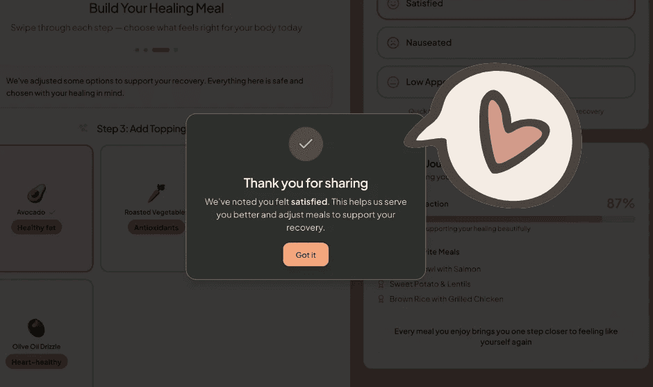
Predictable micro-interactions: Nothing flashes or jumps. Selected items glow softly. Confirmation modals appear gently and close quietly, creating a sense of closure rather than interruption. Micro-interactions are intentionally slow and subtle, designed to support patients whose nervous systems may be overstimulated by pain, medication, or anxiety.
Figure 10: Patient Facing Dashboard Thanks for Sharing MicroInteraction
key patient-facing features
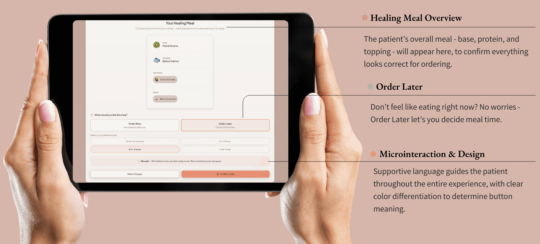
The guided meal builder allows patients to build meals through a simple, linear flow: Base → Protein → Toppings → Sides. Contraindicated items are auto-hidden, while supportive options are highlighted according to biological needs (such as iron-rich, gentle on nausea, easy to digest). The component pattern for each food card remains consistent - soft borders, rounded corners, ample padding, and centered illustrations - creating visual predictability that makes the interface feel emotionally safe. Additionally, this meal builder includes an appetite-based timing option near the end of ordering. Instead of forcing meals into rigid hospital rounds, patients can select windows that reflect real bodily rhythms of: Order Now, In 30 minutes, In 1-2 hours, and No Rush. Timing buttons use large tap targets and peach outlines for selected states, increasing accessibility for tremors, swelling, or low motor control. This timing flexibility is essential for postoperative, postpartum, or chemotherapy patients navigating fluctuating appetite cues.
After eating, patients can then share how they feel through the options of: satisfied, nauseated, or low appetite. While originally there were many other options patients could choose from on this screen, the choice to refine it down to 3 simple options was chosen in order to again reduce cognitive load. This one-tap feedback closes the loop between nutrition, symptoms, and emotional experience. It also sends signals to the caregiver dashboard so staff can adjust meals without requiring a patient to advocate repeatedly. The feedback buttons use pill-style components with soft outlines, and the confirmation modal uses a dark-olive overlay to create focus while maintaining warmth - avoiding the harshness of clinical alert dialogs.
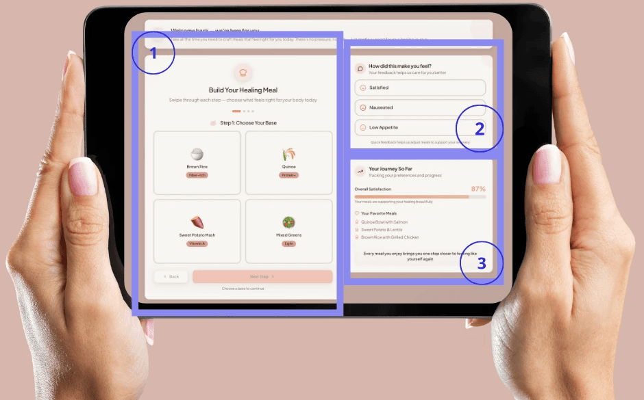
Finally, a personalized journey summary via the headlined card of “Your Journey So Far” quietly tracks satisfaction trends, favorite meals, and recovery patterns. This not only empowers patients but also reduces cognitive load by making future meal choices easier. The summary card uses a soft blush progress bar and generous white space, making the information easy to scan even when patients feel cognitively foggy. You can view each specific section mentioned above on the prototype image below:
Figure 10: Patient Facing Dashboard - Primary Sections
inclusive & clinically sensitive design
To provide clinical sensitivity, the interface adapts to real medical needs without making the patient do the diagnostic work themselves. For example:
Iron-supportive meals would be prompted with priority for postpartum patients
Nausea-friendly options included for individuals on medication
Gentle, low fiber meal options for GI sensitivity
Protein-forward meals specifically for surgical recovery.
Nothing is labeled in a way that shames or moralizes, and instead, everything is framed as support. Supportive labels (“Easy to Digest,” “Nausea-Friendly,” “Iron-Rich”) replace medical jargon with gentle, intuitive cues. Building on these themes of sensitivity, it was important to also prioritize cultural and dietary inclusion. For many patients, food is deeply cultural. The system is also designed to expand beyond Western-centered menus by including familiar comfort dishes across cultural backgrounds. Dietary needs (vegetarian, halal, kosher, pescatarian, keto) can also be layered in without creating friction.
Additionally, accessibility and cognitive support was a priority for HP&P to truly be seen as inclusive and clinically sensitive. Within the interface, patients will see specific accessibility and cognitive support features such as:
Large tap targets for those with tremors, limited mobility, or arthritis (Large tap targets (~48px+) accommodate limited dexterity, tremors, or fatigue.)
Icon-based food options for low literacy or multilingual contexts (Icons and imagery support patients with low literacy or who speak English as a second language.)
Short sentences that reduce cognitive effort (A linear, step-by-step flow prevents confusion and reduces working-memory load, and Minimal motion and predictable interactions support individuals prone to nausea or dizziness.)
Soft illustrations for anchoring and memory support (Food illustrations are intentionally soft and stylized rather than hyper-realistic, which reduces cultural bias and emphasizes comfort.)
An avoidance of jargon and medicalized phrasing.
The entire experience is designed with the assumption that patients are not operating at full cognitive or emotional capacity, because most likely, they aren’t. Finally, the interactions within the dashboard are also trauma-informed. Language never pressures the patient to eat. Instead, options like “No Rush” acknowledge the emotional reality of healing, where appetite is tied to pain, sleep, anxiety and medication. A specific screen walkthrough of the meal-ordering process can be seen below:
Figure 11: Patient Dashboard Design Features
impact on patient experience
This dashboard does more than streamline meal ordering; it transforms the emotional and practical experience of nourishment in a hospital setting. Patients feel more in control, as the act of choosing becomes a small moment of autonomy in a space where many choices have been taken away. Meals are better aligned with symptoms, so patients can choose what they can actually stomach, reducing waste and increasing comfort. While the patient indeed benefits from this entire interaction, the care team also simultaneously gains meaningful insight. The feedback loop helps both nurses and dietitians to adjust care without needing the lengthy conversations during those busy shifts. Emotional safety improves through warm language, predictable interactions, and sensitive design cues that help reduce anxiety, shame and overstimulation. And finally, and perhaps importantly, sustainability benefits emerge naturally all the while. When patients order what they actually want and when they actually want it, food waste drops significantly
In short, by centering choice, calm, and compassion, the patient dashboard reframes hospital meals as a healing moment - not another source of stress. Immerse yourself in this patient experience by viewing a prototype of the patient experience process, where you can chose specific meal options for yourself:
When the patient dashboard restores agency at the point of choice, the next natural question becomes: who supports that choice? Patients don’t heal in isolation. Every tap, every meal selection, and every piece of symptom feedback flows directly into the hands of the people standing at their bedside. Meals don’t exist on their own. Meals become communication. They become signals - clues about appetite, comfort, pain, and recovery. This is where the caregiver dashboard begins, not as a separate tool but as the continuation of the same story - a story about reducing burden, restoring clarity, and helping care teams stay connected to the humans behind the data.
clarity, connection & clinically grounded
If the patient dashboard restores choice, the caregiver dashboard restores clarity. While patients are navigating pain, fatigue, or overstimulation, caregivers are also navigating something just as demanding: constant context-switching, information overload, and the emotional labor of caring for dozens of people, while rarely caring for themselves.
The caregiver dashboard recognizes a truth often missing from hospital technology: care teams are trying to deliver compassionate care while working inside systems that make it harder than it needs to be. Endless clicks, scattered notes, unclear dietary restrictions, and contradictory information all pull attention away from what matters most: human connection at the bedside. Every visual decision within the caregiver’s dashboards- every color, margin, tag, and interaction - follows a single neurodesign principle: reduce cognitive load so caregivers can stay connected to the humans in their care. It acts as a steadying surface - calm, predictable, and clinically meaningful. Instead of forcing caregivers to interpret fragmented data, the dashboard brings the right information forward at the right time, always in a tone that respects the weight of their work.
The deep navy foundation creates a sense of quiet focus, anchoring the experience visually amidst the bright, overstimulating hospital environment. Warm creams and muted neutrals soften the interface so it never feels clinical or cold. Rounded surfaces, wide breathing room, and gentle shadows mirror the patient interface intentionally - because safety and calm should flow across the entire system, not only to one side of the care relationship.
Figure 12: Caregiver Dashboard Overview

core pillars
Below, the caregiver dashboard unfolds into five core pillars that together form a steady rhythm for the workday:
at-a-glance clinical insight
At a glance, caregivers are offered quick clarity when they don’t have a second to spare. The first section offers a gentle, high-level orientation: patients with new restrictions, dietary flags, or meals requiring attention. Instead of large tables or clinical grids, information is displayed through soft-rounded cards that preserve visual calm. The dashboard opens with a warm, cream-toned card summarizing patient dietary flags, new restrictions, and changes that matter for the current shift. The design mirrors the visual softness of the patient experience: rounded corners, generous spacing, and warm-gold tags that signal priority without mimicking the harshness of medical alerts.
This “entry point” is intentionally quiet - like a deep breath at the start of a hectic shift. The goal is not just to present information but to stabilize the caregiver’s attention. The card’s predictable hierarchy - patient name, room, flag, and brief note - supports rapid scanning and reduces the cognitive jumps typically required when referencing multiple systems. This is clarity as an act of care.
Figure 13: Entry Points of Primary Caregiver Dashboard
This mirrors the patient philosophy of reducing cognitive burden, except here, the goal is to help caregivers immediately understand where their attention is needed without scanning multiple systems. Visually, warm golden tags highlight priority changes without triggering alarm fatigue. The intention is subtle but important: alert caregivers, not activate them.
real-time meal selections & safety checks
Finally, caregivers can now view nutritional safety without the scavenger hunt! In current hospital workflows, dietitians and nurses often must cross-check ingredients manually, compare them against contraindications, and then verify whether patient choices align with their recovery stage. This dashboard dissolves that complexity. Meal selections appear as soft slate-gray cards - functional but gentle - each one reading like a small story of what the patient has chosen and why it matters. The muted gray background is carefully chosen: it carries enough contrast for readability while avoiding the cold, metallic tone common to clinical interfaces.
Inside each card, ingredients are grouped into warm-gold tags and subtle metadata chips that surface essential information (base, protein, sides, toppings). Contraindication alerts appear in light coral bands - noticeable but never alarming - guiding caregivers’ attention through color psychology rather than urgency. Within each card, supportive metadata is quietly embedded: nutrient tags, drug–nutrient conflict alerts, allergy warnings, and dietary restrictions. It reinforces the same neurodesign principle applied to the patient experience: only present what is necessary in the moment. Nothing more. The component structure echoes the patient’s meal builder: consistent patterns, consistent spacing, consistent meaning. This predictability reduces mental effort. Caregivers don’t need to “learn” the interface; it feels familiar the moment they see it. Timing indicators (like “preparing” or “pending”) are intentionally gentle, using soft outlines instead of bright statuses that spike cognitive arousal.
Figure 14: Caretaker Dashboard - Real-Time Meal Selections and Contraindication Alerts
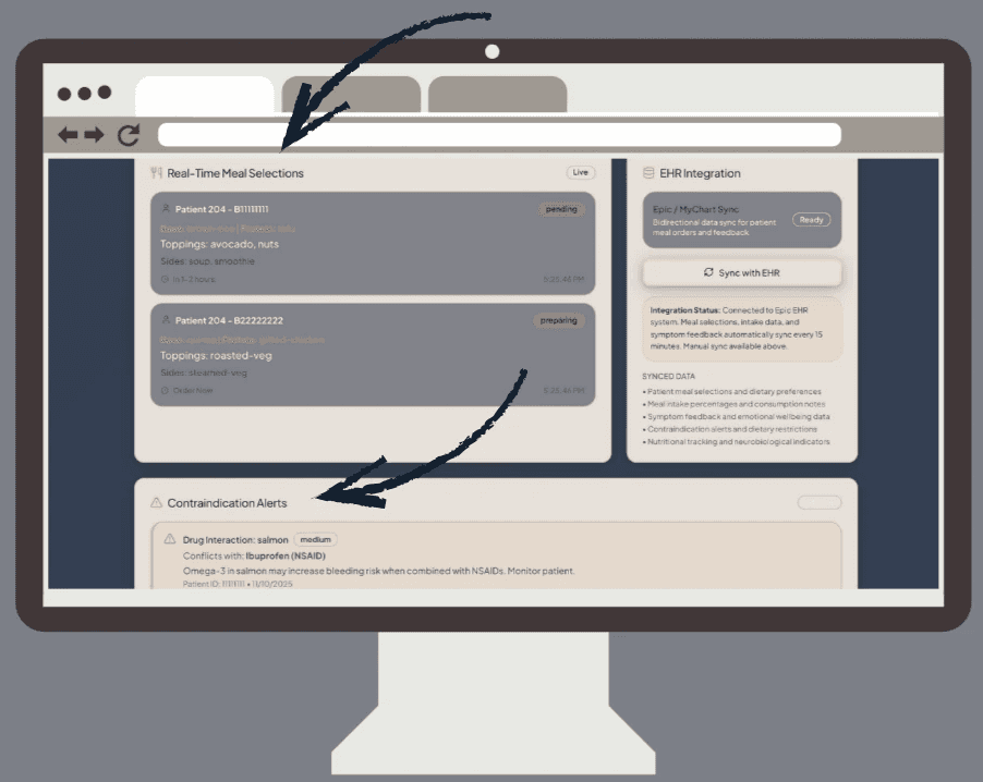
And most importantly, every safety check is integrated directly into the card, eliminating the common workflow: click → open → compare → return → check restrictions → reopen. Instead, caregivers see everything at once, without the friction. The design isn’t just efficient. It’s protective.
neurobiological indicators for meaningful support
Where the patient experience emphasizes emotional safety and supportive language, the caregiver view emphasizes clinically meaningful connection - turning nutrition into clinical insight, not another checklist.
Ingredients appear as a symmetrical grid of soft slate cards, each with warm tag chips indicating supportive neurobiological effects: mood regulation, cognitive support, energy stabilization, reduced inflammation. These labels mirror the patient-facing tags but take on a more clinician-friendly tone-still warm, still intuitive, but slightly more grounded. Ingredients like berries, nuts, salmon, tofu, and avocado appear in structured cards with warm, intuitive tags such as:
mood support
cognitive steadiness
reduced inflammation
fatigue regulation
Figure 15: Caregiver Dashboard “Today’s Menu”
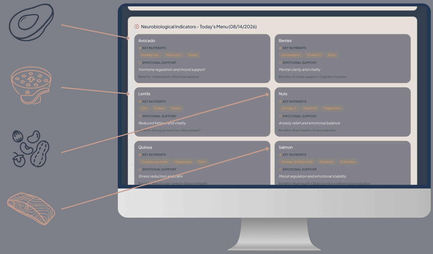
The color palette is intentionally low-arousal: neutrals and muted tones that support comprehension without competing for attention. The even spacing and grid alignment provide a rhythm that slows mental pacing-caregivers can browse without feeling rushed or overstimulated. The purpose of this section is not to instruct, but to illuminate. It offers clinical context in a humane, approachable way - supportive, never punitive.
Figure 16: Caregiver Dashboard Color Palette

These are not presented as instructions, but as context - a way to help caregivers understand how meals support recovery on a biological level. The design stays soft and neutral, ensuring these indicators feel like quiet clinical companions rather than new responsibilities. This mirrors the patient flow: gentle, affirming, and supportive - just adapted for a different role within the system.
patient-specific deep dive & care communication
The caregiver dashboard also gives the options to view each patient on a deeper, more specific level - perfect for when caregivers need to slow down and focus on one human, not a list. Selecting a specific patient shifts the interface into a calmer, more spacious layout. Breathing room increases, padding widens, and the emotional tone slows intentionally. In this view, caregivers see:
dietary restrictions
current medications
nutrient priorities (protein, iron, hydration)
feedback trends over time
communication log
By widening spacing and reducing density, the design gently signals: this is the moment to slow down and pay attention. The page structure reinforces this with soft hierarchical transitions - light headers, softened dividers, and consistent card templates-so caregivers can focus on the person, not on parsing layout differences. This view reflects the emotional labor of caregiving: precise, human, attentive.
Figure 17: Maria Rodriquez - Specific Patient Page

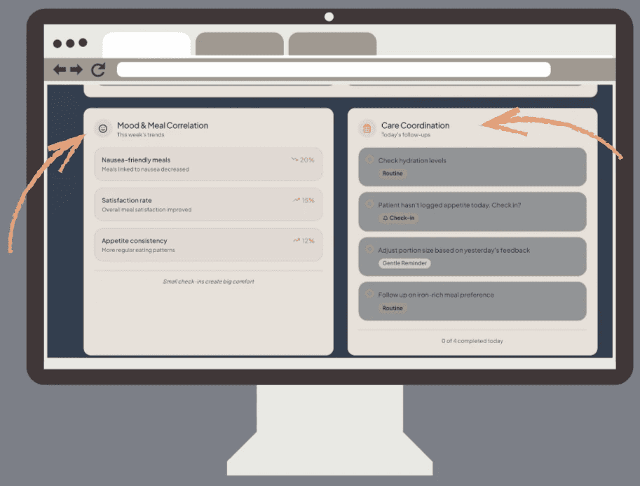
care communication & coordination
Communication and coordination sit at the core of safe, connected care, and the caregiver dashboard highlights these touch-points directly. On the main dashboard, two elements anchor this work: the Mood & Meal Correlation, which surfaces behavioral or emotional shifts tied to eating patterns, and the Care Coordination Checklist, which consolidates immediate tasks, observations, and follow-ups into a single glanceable space. Together, they give caregivers a shared starting point for understanding how a patient is doing today and what needs attention next.
Figure 18: Caregiver Primary Dashboard - Mood & Meal Correlation and Care Coordination
On the patient-specific page, communication becomes more granular and actionable. The Last Meal summary provides quick clinical context for how the patient ate and how they felt afterward. Directly beneath it, caregivers can use the “Send Note to Kitchen Team” feature to type and submit real-time updates about appetite changes, texture issues, new allergies, or safety concerns. This keeps nutrition staff in the loop without requiring extra steps or separate systems. Below that, the Communication Log organizes handoff notes, observations, and comments in a clean, chronological feed so incoming caregivers can immediately understand what has changed and what matters most.
Figure 19: Caregiver Primary Dashboard: Specific Patient View - Last Meal, Send Note and Communication Log

This is particularly important during high-stress handoff windows, where readability can directly impact patient safety. The interaction pattern follows trauma-informed design:
Notes update quietly.
Nothing jumps or flashes.
Caregivers stay centered in their task.
This clarity helps prevent miscommunication during shift changes-the moments where patients often feel the effects of fragmented information. The result is communication that feels less like documentation and more like shared understanding.
seamless EHR integration: complementary, not competitive
The Healing Patient & Planet dashboard is designed to complement - not compete with - existing EHR systems like Epic and MyChart. Within the caretaker’s prototype, this integration appears as a dedicated EHR Sync module, allowing real-time bidirectional data flow every fifteen minutes. Patient meal selections, intake data, symptom feedback, and emotional wellbeing notes automatically connect to Epic’s system, minimizing redundant documentation and keeping care teams aligned. The synced data includes dietary preferences, contraindication alerts, and neurobiological indicators such as nutrient-linked mood or fatigue markers - turning mealtime interactions into meaningful, measurable care signals. By embedding within Epic rather than existing alongside it, the HP&P dashboard becomes a quiet integrator: one that enhances the data hospitals already trust, while introducing a human-centered layer focused on dignity, nutrition, and sustainability.
Figure 20: Bidirectional Data Sync
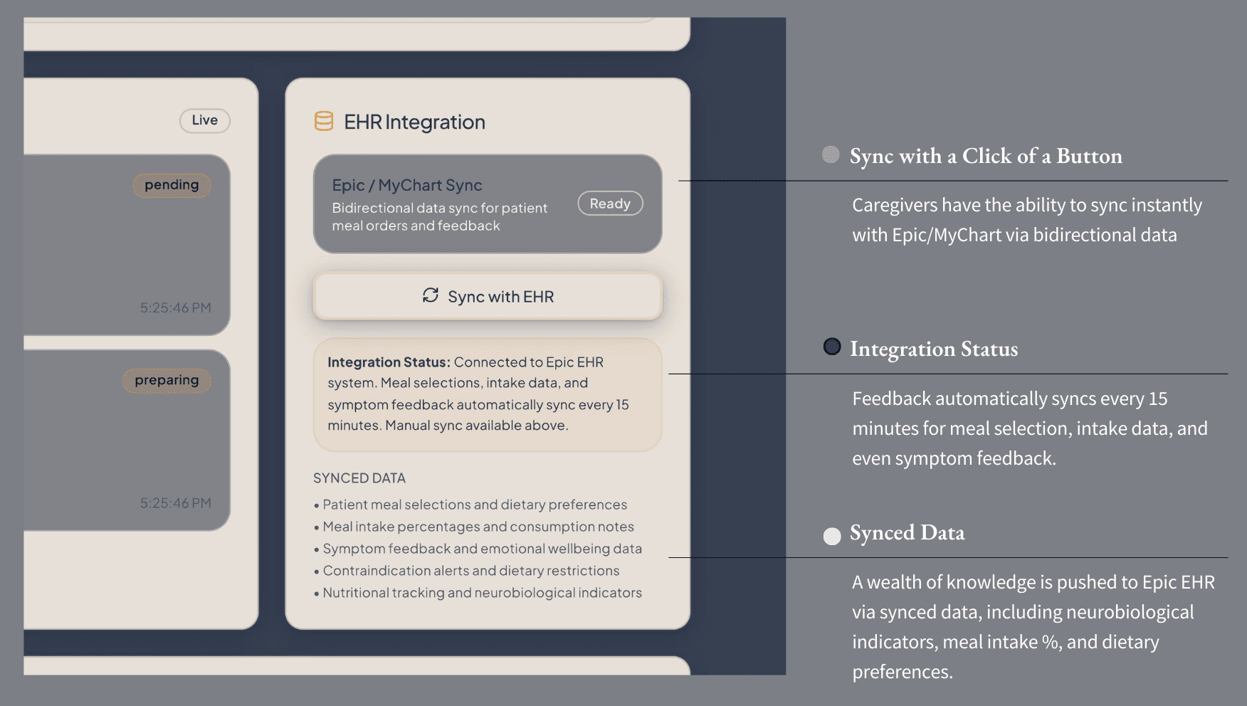
integration stance (how it fits today)
The dashboard integrates directly with existing EHR and foodservice tools like Epic and MyChart, syncing meal selections, intake data, and symptom feedback every fifteen minutes. This ensures nutrition, comfort, and neurobiological insights flow seamlessly into hospital systems, reducing duplicate work and aligning care teams around shared data.
Immerse yourself in the caretaker’s experience by viewing a prototype of the experience process, where you can chose between an caretaker overview and/or by specific patient options for yourself:
As caregivers move through their day - documenting symptoms, adjusting meals, noting patterns - they generate something administrators rarely receive: context. Not numbers...narratives. Not just metrics....meaning. The administrator dashboard gathers all of these micro-moments and reveals the macro-truths beneath them. Where caregivers see trays and timing, leaders see patterns, trajectories, and system-level consequences.
And just as the caregiver view echoes the patient’s emotional logic, the administrator view echoes the caregiver’s operational reality. It’s the balcony view - the long horizon where healing and stewardship finally converge.
big-picture insight at a glance
If the patient dashboard restores choice, and the caregiver dashboard restores daily flow, the administrator dashboard is where perspective is restored. This is the balcony view - the moment where leaders can finally step back and look across the system as a whole, asking not just “What happened today?” but more importantly, “What does this mean for our care culture, our budget, and the planet we’re accountable to?”
And, the pressures for administration can feel just as real as those from the patient and caretaker side of things, operating on immense pressure. With rising costs, sustainability mandates, labor constraints, and that ever-present expectation to do more with less, the pressure can feel like the gravity of hundreds of lives are sitting on top of the admin’s chest. Within the HP&P dashboard, it was important to help eliminate this stress with straightforward information alongside visual representations of the data for quick analysis. The design here reflects that mindset: generous spacing, calmer colors, and quietly confident charts that don’t overstate progress or hide the hard truths. It’s sustainability without the performative gloss. It’s clarity as a form of accountability.
More than anything, this dashboard exists to illustrate one simple idea: when patients are nourished well and caregivers work within an intuitive flow, the entire hospital ecosystem becomes healthier - operationally, financially, and environmentally.. It shows how improvements in choice, participation, and satisfaction ripple upward into measurable sustainability outcomes: less waste, better sourcing, and more efficient operations.
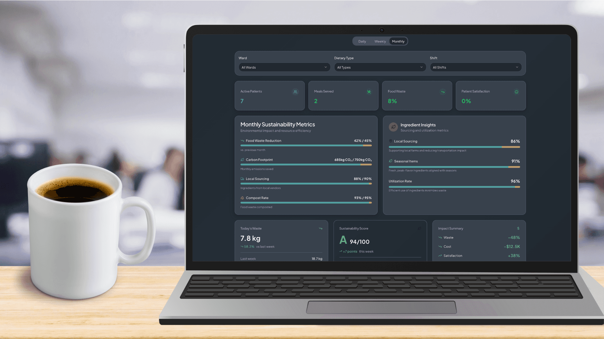
Figure 21: Admin-Dashboard in Monthly View
The interface uses the same design system foundations woven throughout the entire project: consistent grids, semantic color palettes, modest typography, and visual humility. This isn’t a sales pitch; it’s a mirror held up to the system, showing both its constraints and its potential. By grounding sustainability in everyday behavior - not abstract targets - the dashboard reframes stewardship as a natural extension of care quality.
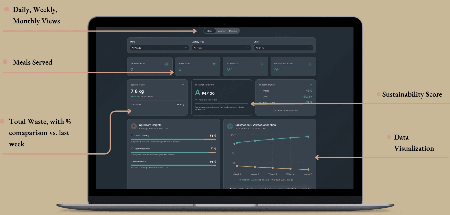
system-wide lens
The dashboard opens with a set of high-level tiles that function almost like vital signs for the hospital’s food system. Each tile uses low-arousal colors, consistent spacing, and short, semantic labels to give leaders clarity in a single glance. Here leaders can see:
Food Waste %
Meals Served
Today’s Waste vs. Last Week
Sustainability Score
Impact Summary (waste, cost, satisfaction)
These tiles mirror the visual language of the other dashboard - the same rounded corners, warm neutrals, and predictable hierarchy - reinforcing that each view is simply a different angle on one shared truth.
Figure 22: Admin Dashboard Daily View with Specific Sections
operational indicators & real-time waste monitoring
While caregivers experience waste as moments - unfinished meals, tray returns, batch prep - administrators see its accumulation. Here, real-time waste metrics, ingredient utilization rates, and overproduction patterns appear in a modular card layout designed for scanning without overwhelm. The design system guides meaning through subtle color logic:
neutrals for baselines
soft greens for positive deltas
warm terracottas for areas of concern
gentle gradients to draw attention
Figure 23: Admin-Dashboard Color Palette

These visuals are intentionally emotionally “neutral”, so leaders can interpret patterns without feeling like the dashboard is sensationalizing the data or minimizing systemic challenges. The goal is honesty, not pressure.
sourcing & stewardship transparency
Sustainability isn’t just about reducing waste, it’s about what the hospital chooses to bring into its ecosystem. This section provides visibility into:
Local sourcing ratios
Seasonal ingredient use
Carbon footprint reductions
Compost rates
Earthy ones from the shared palette (desaturated greens, deep olives, and gentle neutrals) ground this data in something tangible and real. Nothing is dressed up to look better than it is - a deliberate choice that builds trust and reinforces the dashboard’s core ethic that sustainability should be transparent, traceable, and human-centered.
Figure 24: Monthly Sustainability Metrics + Ingredient Insights
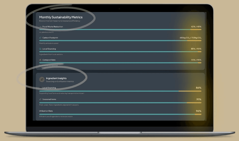
Here, stewardship becomes visible. Choices ripple outward, and administrators can finally see how sourcing practices connect back to cost and patient experience.
predictive forecasting & demand planning
One of the most powerful components of this dashboard is its predictive capability. Instead of reacting to surplus food or unexpected shortages, administrators can anticipate demand based on patterns emerging from patient choices and caregiver workflows. Some analyzations by the system include:
peak meal times
dietary type trends
satisfaction patterns
unit-level ordering behavior
Figure 25: Administrative Dashboard Weekly View
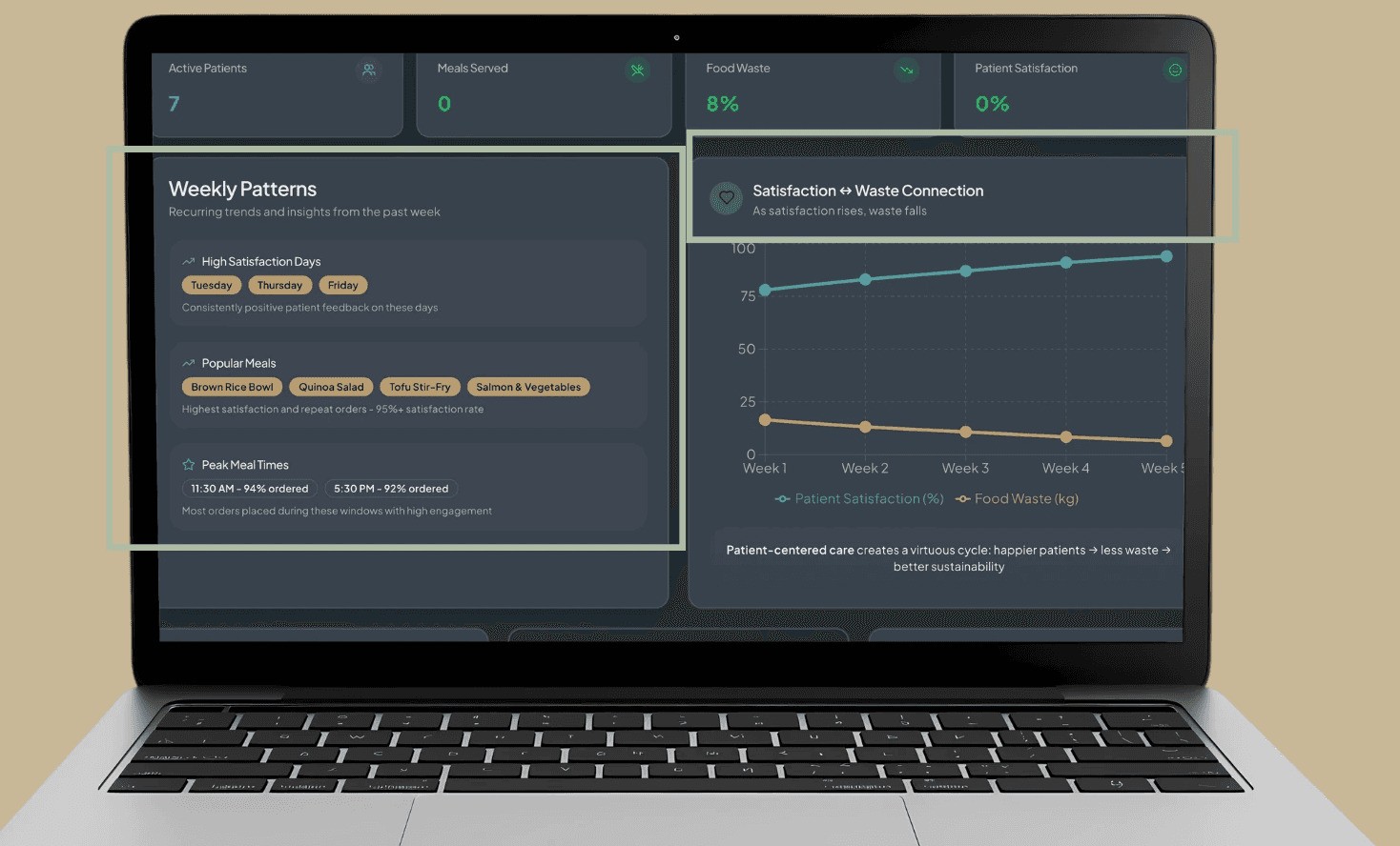
Forecasting via weekly patterns or even multi-week visuals also shows both satisfaction with waste connection. These sections follow the same visual rhythms as the rest of the system - slow animation, soft hues, and predictable axes - so nothing feels cognitively jarring or disconnected. In doing so, it transforms “we overproduced again” into “our system is learning how to support us”.
narrative impact & ROI storytelling
The administrative dashboard ties everything together in a steady narrative that underpins the entire capstone:
When patients are satisfied, waste decreases.
When waste decreases, costs decline.
When costs decline, sustainability becomes more achievable.
The design system supports this narrative with subtle motion, honest deltas, and interpretable lines that never oversell the results. This section becomes an organizational narrative tool - something that executives can use it for ESG reporting, stakeholder conversations, presentations, and strategic planning. It gives leadership something rare in hospital food data: a clear, casually coherent pathway from behavior into insight into operational outcomes.
sustainability-specific framework (what “sustainable” means here)
In the context of HP&P, sustainability doesn’t mean overhauling supply chains or building solar-powered cafeteria; it means something as simple as designing systems that prevent waste through behavioral and operational alignment. To be more specific, I’m focusing on behavioral sustainability: the idea that when people (patients and staff) are more informed, engaged, and emotionally connected to choices, they waste less and use resources more responsibly. With this, the sustainability layer has three realistic, research-backed dimensions that is shown in the MVP:
Three pragmatic layers:
Waste Reduction (Operational): when patients choose what they’ll actually eat and kitchens prepare to real-time demand, plate waste naturally declines.
Responsible Sourcing (Ethical): local, seasonal, and plant-forward metrics become visible, which makes them measurable and repeatable.
Resource Management (Economic): cost, waste, and satisfaction data interlock, revealing an ROI model grounded in emotional and operational reality.
So, instead of “sustainability” as a broad green goal, sustainability in HP&P emerges from design choices that align human behavior with environmental care. Within this MVP, sustainability isn’t about infrastructure or supply chain; it’s behavioral. When patients choose what they want and feel ownership in the process, plate waste drops naturally. Sustainability becomes a reflection of dignity and choice rather than an operational target. In hospitals, this behavioral truth becomes a sustainability strategy: dignity and empathy naturally drive efficiency. Patients who feel seen and engaged are more likely to eat what they order, reducing plate waste and improving satisfaction scores without additional cost.
In this sense, sustainability emerges as an outcome of empathy, not an operational mandate. When comfort and control are built into the patient experience, waste decreases as a byproduct of care done well. The result is what I call behavioral sustainability - a feedback loop where emotional wellbeing, operational efficiency, and environmental stewardship reinforce one another.
By allowing patients to personalize meals within dietary constraints, the system reduces untouched food and improves satisfaction, turning choice into both a psychological and operational sustainability strategy. On the administrative side, a sustainability dashboard visualizes key metrics like plate waste, ingredient utilization, and sourcing transparency, transforming data into actionable insights. Together, these layers form a closed feedback loop where emotional wellbeing, responsible resource use, and financial efficiency reinforce one another, proving that healing the patient and healing the planet can coexist within the same system.
Immerse yourself in the administrators experience by viewing a prototype of the admin dashboard, where you can chose between daily, weekly, and monthly views:
Once administrators see how daily choices ripple outward, from appetite to waste, from waste to cost, from cost to sustainability, the system becomes visible as a loop instead of a line. Patients choose, caregivers coordinate and administrators interpret. And together, those choices reinforce one another in a behavioral sustainability cycle - a loop where dignity, efficiency, and stewardship become part of the same ecosystem rather than competing priorities
↦ the solution:
together: three faces, one system, one loop:
What we are looking at within Healing Patient & Planet are three dashboard, one ecosystem, and one behavioral loop. The patient dashboard restores dignity; the caregiver dashboard restores flow; and the administrator dashboard restores direction and accountability. Together, they operate not as separate told but as three vantage points on the same living system - a system where emotional experience, clinical workflow, and organizational stewardship continuously shape one another.
And, in this shared ecosystem, the core argument becomes clear: improving mealtime isn’t just improving food; it’s improving care, culture and the planet at the same time.
design principles (how it should feel)
The entire system is anchored in four design principles that guide behavior without force:
Empathy through data: metrics that honor comfort and dignity, not just compliance.
Neurodesign, quietly applied: visual calm, clear hierarchy, predictable flows.
Behavioral reinforcement, not pressure: highlight better options; never shame.
Sustainability as standard: stewardship presented as part of clinical quality, not a separate initiative
These principles shape behavior, which is what ultimately powers the loop.
the behavioral sustainability loop (level → behavior → system impact)
patients
Human action: choose modular meals within safe defaults → System impact: plate waste ↓, satisfaction ↑, participation ↑
Personalized Choice: Patients build meals using a modular, guided system (base → protein → toppings).
Options are automatically filtered by restrictions, ensuring safety without making limitations visible, reducing shame and cognitive load.
Metrics:
Reduced Plate Waste (%) - fewer untouched trays reflect increased appetite engagement.
Participation Rate (%) - measures behavioral ownership; patients are more likely to eat what they chose.
Emotional rationale:
When patients feel seen and supported, they eat more confidently - and waste less.
staff & caregivers
Human action: prepare to real-time selections; log intake & leftovers simply → System impact: ingredient utilization ↑, forecast accuracy ↑
Behavioral Coordination : Kitchen teams prep components in batches based on active selections.
Caregivers add quick feedback (satisfied, nauseated, low appetite), forming a soft but powerful behavioral data trail.
Metrics:
Ingredient Utilization (%) - reflects alignment between supply and true demand.
Meal Forecast Accuracy (%) - shows how well the system “learns” from patient rhythms.
Emotional rationale:
When caregivers aren’t firefighting conflicting systems, they support patients more effectively - and the system becomes predictably humane.
administrators
Human action: read combined behavioral + operational data → System impact: sustainability savings ↑, local sourcing ↑, clear ROI patterns
Data-Driven Oversight: The administrator dashboard synthesizes patient behavior + caregiver workflows into one coherent narrative.
Leaders see not just outcomes but the patterns behind them.
Metrics:
Sustainability Savings ($) - cost reductions linked to decreased waste.
Local/Seasonal Sourcing Ratio (%) - visibility makes responsible procurement repeatable.
Satisfaction–Sustainability Correlation - reveals how emotional wellbeing aligns with resource efficiency.
Emotional rationale:
When leaders see stewardship emerge from dignity and workflow (not mandates) sustainability becomes a shared cultural value.
closed feedback loop: why it works
Within this feedback loop, each level feeds the next. The patient choices create behavioral data, while the caregiver actions generate operational insights. And all the while, administrators interpret those signals into strategic insights.
Closed Feedback Loop: Improvements in patient autonomy lead to higher satisfaction, which reduces waste, which saves cost, which justifies reinvestment in sustainable sourcing - completing the cycle of “healing both patient and planet.”
Behavioral Design Integration: Each actor participates in sustainability without friction - patients through natural choice, staff through workflow efficiency, and administrators through actionable dashboards.
This is the essence of behavioral sustainability - a loop where dignity, efficiency, and stewardship reinforce one another without added burden.
Figure 26: Behavioral Sustainability Loop

impact (what success looks like)
When implemented in women’s hospitals, this framework has the potential to:
Recovery supported: meal timing and composition align with hormonal and metabolic needs.
Dignity restored: patients feel seen through simple, safe choice.
Waste and cost down: visibility → precision → savings.
Culture shift: food reframed as care; stewardship becomes shared pride.
In essence, food systems are healing systems, and the ethics of care extend from the patient’s plate to the planet itself.
↦ implementation
insight to integration
Implementation, at its best, isn’t about installing a tool. It’s about inviting a new way of caring into systems that already exist. The HP&P dashboard is intentionally designed to slip into the digital rhythm of the hospital, not compete with it. By connecting it directly to Epic/Cerner, dietary databases, and sustainability trackers, it turns the data hospitals already collect into something more human: insight, comfort, and accountability.
Women’s hospitals remain the natural starting point. They sit at the intersection of biology, emotion, and identity, where nourishment is both medical and deeply personal. These environments allow us to test how sex-specific nutrition, behavioral design, and sustainability interact as a single, cohesive form of care.
pilot structure
Location:
the pilot will launch in a small-to-mid-sized women’s hospital or specialized unit (oncology, gastroenterology, or perinatal care). Ideal candidates will have:
Existing or emerging sustainability initiatives
A diverse patient population
Leadership openness to digital innovation
Willingness to serve as a model site for future expansion
phases
Figure 27: Implementation Phases
stakeholder involvement
Stakeholders will see the upside too, as every stakeholder benefits when empathy scales. For hospitals, it means stronger patient reviews, measurable waste reduction, lower costs, and alignment with sustainability goals. In value-based care models, satisfaction directly ties to reimbursement (Relias, 2025), and public reporting tools like HCAHPS shape both reputation and funding (Dhiman & Diaz, 2015; CMS, 2025).
Hospital Administrators: Integrate satisfaction, waste reduction, local procurement, cost-savings and ESG-aligned metrics directly into decision environments. This also opens a marketing/communications opportunity via:
ESG reporting
Community health storytelling
Evidence of ethical, dignity-centered care
Proof that improved experience leads to measurable outcomes
Dietitians & Caregivers: Use realtime consumption metrics to tailor care plans, flag nutritional risk, and understand appetite disruptions early.
These metrics help complement Press-Ganey and in-house patient experience tools by providing moment-by-moment, behavior-based data, not just retrospective surveys.
Sustainability Officers: Monitor waste reduction, composting/diversion improvements, and carbon impact aligned with Practice Greenhealth benchmarks.
Patients: Offer feedback on comfort, clarity, and sense of choice, helping shape the emotional tone of the system itself.
potential partnerships/sponsors
Meaningful change requires collaboration across disciplines:
Healthtech Collaborators: Epic, Cerner, and innovation-focused startups
Academic Partners: Nutrition-science labs, behavioral design labs, neurodesign researchers
Sustainability Organizations: Practice Greenhealth, Health Care Without Harm
Design & Innovation Studios: For interface refinement and interdisciplinary design reviews
These partnerships keep the system clinically credible, operationally feasible, and emotionally grounded.
metrics for success
Success must be clinical, behavioral, operational, and emotional, because healing happens across all four. Within the metric for success, the outcomes fall into three categories:
Sustainability & Operational:
10–20% reduction in plate waste within pilot units
↑ Ingredient utilization & batch-prep accuracy
↑ Local procurement transparency
↓ Total food-related costs per patient day
Clearer ESG reporting pathways
Clinical & Behavioral Outcome:
Real-time consumption metrics → improved personalization
↑ Nutritional adherence & intake consistency
↓ Mealtime anxiety, appetite disruption
A1c reduction for patients with diabetes
Reduced pre-term birth risks / improved NICU-related nutrition stability
Improved postpartum depression and behavioral health indicators
↓ ER visits and unplanned readmissions (nutrition-linked)
Emotional & Experiential:
↑ HCAHPS and Press-Ganey scores (with real-time metrics as a complement)
↑ Sense of dignity, choice, and autonomy
↑ Caregiver alignment with sustainability and values-based care
Stronger patient narratives that support hospital brand storytelling
Together, these outcomes build the foundation for a replicable model that scales across units and hospital systems, proving that when we design for both people and the planet, hospitals don’t just run better. They heal better.
↦ next steps
going forward
As I move into the next stage, the challenge will be balancing several goals at once: designing a system that helps patients access the healing properties of food, reducing the massive amounts of hospital food waste, and restoring patient dignity by honoring their tastes, cultures, languages and - most importantly - choice. Each of these goals serves a different set of stakeholders: improving patient satisfaction scores, reducing costs, and supporting smoother recovery timelines.
But, I also want to stretch the definition of “success”. Beyond operational gains, what if hospitals used their food systems to strengthen their communities? Could composting, food donation, or local sourcing be added to help close the loop between patient care and public good? Someone in class mentioned that in parts of California, people travel to hospitals just to eat because the food is that good. That image stuck with me. What if hospital kitchens could nourish not just patients, but the neighborhoods around them?
In the immediate future, my focus is on refining the three dashboards that anchor this framework:
a patient-facing experience that feels intuitive and empowering,
a caregiver layer that integrates medical oversight without adding complexity, and
an administrative view that visualizes sustainability, satisfaction, and cost in real time.
From a research perspective, I plan to study more case examples, like New York hospitals that have already reimagined their food and waste programs, and dig deeper into the neuroscience of nutrition. How do iron-rich foods support postpartum recovery? How does reducing certain toxins or preservatives accelerate healing? These questions matter because food doesn’t just sustain health; it actively shapes it.
I’m also interested in exploring nutrition design across populations. How do pediatric or oncology units handle meal personalization differently? Which hospitals are already testing choice-based ordering systems, and what can we learn from them? Understanding these nuances will help identify the most feasible pathways for adoption and scale
future directions (long-term visions)
As the MVP evolves, future phases will focus on expanding behavioral sustainability into operational and community systems.
modular food - prep & scalable meal models
Future iterations may explore operational models that extend the behavioral insights of HP&P into the kitchen itself. One promising direction includes a modular, build-your-meal system similar to fast-casual formats, allowing kitchens to prepare base ingredients in bulk while giving patients the flexibility to customize safely within dietary limits. Research into these models shows that modular preparation reduces spoilage, shortens service times, and aligns production with real-time demand - an operational win that also supports patient autonomy.
For this framework, I use what I called the “Chipotle model”. This modular, “build-your-meal” approach to map well with hospital constraints:
Behavioral Link: Patients waste less when they choose what they want - because personal choice increases ownership and satisfaction (ownership ↑, satisfaction ↑.)
Operational Link: Kitchens can batch-prep base ingredients (grains, proteins, veggies) and then assemble final meals “to order,” minimizing spoilage (assemble “to order” → spoilage ↓.)
Psychological Link: Allowing choice restores dignity, normalcy, and control, which improves recovery and mental state.
Sustainability Link: Less plate waste, fewer untouched trays, and data showing exactly what gets eaten or skipped.
In early stages, this model would function as a hybrid system that layers choice architecture onto existing hospital meal delivery workflows. Meals remain modular (base, protein, topping), allowing personalization without overwhelming production teams. As hospitals gain confidence, they could pilot a small-scale choice station or digital pre-order system in specific units - for example, maternity or recovery wings - to evaluate both patient satisfaction and food-waste outcomes in a controlled environment.
While the promise is strong, these logistical changes fall outside the scope of the MVP and would require collaboration across hospital vendors, foodservice providers, and sustainability officers. If pursued, this approach could become a powerful case study demonstrating how emotional design, behavioral science, and operational efficiency can work in concert to transform healthcare food systems.
intelligent adaptation & personalization
Later phases of HP&P may also explore AI-enhanced personalization, using predictive models to understand appetite, nutrient needs, hormone cycles, or even mood fluctuations. These insights could allow care teams to anticipate patient needs before they surface, strengthening the connection between data and empathy and creating a more responsive, humane food system.
Once the core framework is piloted successfully, the project can move into thoughtful, iterative scaling - expanding first within women’s hospitals, then into pediatric units, oncology centers, rehabilitation programs, and other environments where autonomy, emotional design, and dignified choice are equally essential.
Looking ahead, future iterations may build on this foundation in several ways:
Cultural adaptability: Localizing menus, imagery, and interface language to honor cultural norms, dietary traditions, and community expectations.
Sensory UX testing: Measuring comfort and stress through elements like color, pacing, and visual hierarchy, drawing from neurodesign methods to evaluate emotional impact and refine the system accordingly.
Together, these advancements would evolve HP&P into a deeply adaptive ecosystem - one that learns from patients, responds to their lived experiences, and adapts to the diverse clinical and cultural realities of modern healthcare.
community and systems integration
Beyond hospital walls, HP&P has the potential to become a blueprint for circular care systems. With the right partnerships — local farms, food banks, culinary schools, community kitchens - surplus food could be redirected rather than discarded, strengthening both environmental outcomes and community resilience. These collaborations illustrate how a redesigned food system can ripple outward, supporting not just patients but the ecosystems around them.
And while the current focus is hospitals, the underlying framework reaches far beyond them. Schools, rehabilitation centers, correctional facilities, and juvenile programs all grapple with the same intertwined challenges of dignity, nutrition, and waste. In many ways, these environments offer parallel opportunities for healing through food. What begins as a hospital-based model may evolve into something much larger: a design blueprint for rethinking institutional food systems altogether.
Food is one of the few universal touchpoints that links care, behavior, and environment. By reimagining how institutions nourish people - and how food systems can sustain rather than strip away dignity - we begin to repair something bigger than any single setting: the way we sustain one another.
vision for the future
The goal isn’t to design a “hospital food app.” It’s to redefine what nourishment means inside healthcare systems. In women’s hospitals, that begins with recognizing that food carries dual responsibility: heal the patient, and honor the planet. Over time, this approach can evolve into a replicable framework for compassionate, data-driven food systems: models that make hospitals feel more like spaces of recovery than regulation.
When empathy becomes measurable, and sustainability becomes standard, care itself transforms. Healing and stewardship stop being separate goals; they become the same work, seen from different angles.
↦ reflection
my conclusion
At its core, this project began as a question about food. Somewhere along the way, it became a study of care itself - how it’s designed, delivered, and experienced.
My background in neuroscience and own lived experiences have taught me that healing is never just physical. The same neural pathways that regulate digestion also shape emotion, cognition, and decision-making. When those systems are disrupted, by illness, hormones or stress, people need environments that restore not only balance but belonging. We are currently in a really important and fascinating time where science and studies about the gut-brain axis and its effect on healing, diet, mental health, and so much more are thriving. I know that design, when guided by empathy and evidence, can provide an important, vital connection to health and experience.
Women’s hospitals reveal this truth in its purest forms. They are places where biological and emotional realities coexist, where nutrition intertwines with hormones, cognition, and identity. And, in today’s health-care system, study, strength and special consideration go an especially long way for a previously under-supported population. Designing for these contexts means honoring the body as both a biological and a human system, guided by nuance rather than assumption. That’s why this framework takes a sex-nuanced approach: to meet real physiological needs while maintaining compassion for the diverse identities within them.
The framework I’ve developed for Healing Patient & Planet is more than a technological prototype. It’s a blueprint for measurable empathy, showing that care can be sustainability, that data can be human, and that healing the individual and the planet are not competing goals but parallel ones. In that, it reverberates with so much of my own internal thinking and ethical systems, as I often pour myself into ideas and projects that make a difference, give back, and bring good into this world.
Ultimately, this work is both a design solution and a belief: when systems are built with dignity at their center, even something as ordinary as a hospital meal can become an act of restoration - proof that compassion and care are not luxuries in design but its most essential function.

sustainabite
reducing food waste, one household at a time.
UX/UI design, UX research, UX writing, group collaboration

