designing governance, systems, and adoption for Northwestern’s first unified design practice
impact: established a scalable DesignOps model, design principles, and component foundations to transform a fragmented, siloed ecosystem into a cohesive, accessible, and shared design culture.
my role
Design Systems UX/UI Designer,
DesignOps Researcher, Project Manager
timeline
january - march 2025
tools
Figma, FigJam, Slack, Google Suite,
Northwestern Brand Guidelines
↦ "We can’t control systems or figure them out. But we can dance with them!"
- Donella H. Meadows
↦ why a
design collective?
how might a large, decentralized university design consistently without losing autonomy?
At Northwestern, design lived in silos—spread across departments like the Segal Design Institute, Facilities, and Research Labs. While creativity thrived locally, the lack of a shared system resulted in inconsistent digital experiences, fragmented brand expression, and repeated design work.
For our Design Systems & Operations graduate course (Winter 2025), our team proposed the Northwestern University Design Collective (NUDC)—a hypothetical, cross-departmental design organization that could realistically exist as a unifying force for design and innovation across the university.
With a university spanning research, teaching, healthcare, athletics, and multiple undergraduate, graduate, and professional schools, alignment is non-trivial. Our goal wasn’t to erase departmental individuality, but to enable cohesion where it matters most: usability, accessibility, and trust.
Through audits, workshops, and collaborative synthesis, we examined Northwestern’s current design structures, identified gaps, and explored how a connected DesignOps model could better support institutional goals.
Our mission: build design systems and operations that make Northwestern’s digital presence consistent, human-centered, and scalable.
↦ problem solving
fragmentation prevented scale, clarity, and trust
Northwestern’s design ecosystem showed four systemic challenges:
Fragmentation: 12+ colleges and schools each with their own look and feel
Inefficiency: Repeated design work with no shared foundations
User Experience Risk: Inconsistent navigation, buttons, and layouts diluted the NU brand and made sites harder to use
Scalability Gaps: Without governance, design maturity and adoption could not grow sustainably
Any solution needed to:
Align with Northwestern’s academic mission
Serve diverse stakeholders (students, faculty, alumni, staff)
Provide governance and flexibility for future growth
This framing became the foundation of NUDC: a model designed to unify effort while respecting institutional complexity.
↦ strategic direction
with designOps
turning organizational complexity into a system
Before defining components or visuals, we stepped back to understand the organizational landscape using a DesignOps Canvas. This allowed us to map constraints, stakeholders, workflows, and opportunities holistically. What the Canvas Revealed:
1. The Need for a Centralized Function
Design was happening everywhere—but without shared intake, governance, or standards. NUDC was envisioned as a unifying layer to streamline collaboration, co-create with stakeholders, and deliver cohesive experiences across websites, apps, and marketing.
2. Team Structure & Growth
We proposed starting small: a design program manager, UX researchers/designers, and an operations lead, with future growth into developers and specialists. Recruitment would prioritize students and alumni for cost-effectiveness and cultural alignment.
3. Communication & Knowledge Sharing
Internally, we emphasized structured collaboration through weekly standups and shared tools. Externally, we planned transparency via onboarding sessions, progress updates, workshops, and newsletters.
4. Constraints as Design Inputs
Rather than blockers, institutional constraints—FERPA, Illinois PIPA, ADA/WCAG—became opportunities to embed inclusivity, trust, and compliance into the system from the start.
This canvas grounded our work in accountability, scalability, and alignment with Northwestern’s mission.

↦ our operating model
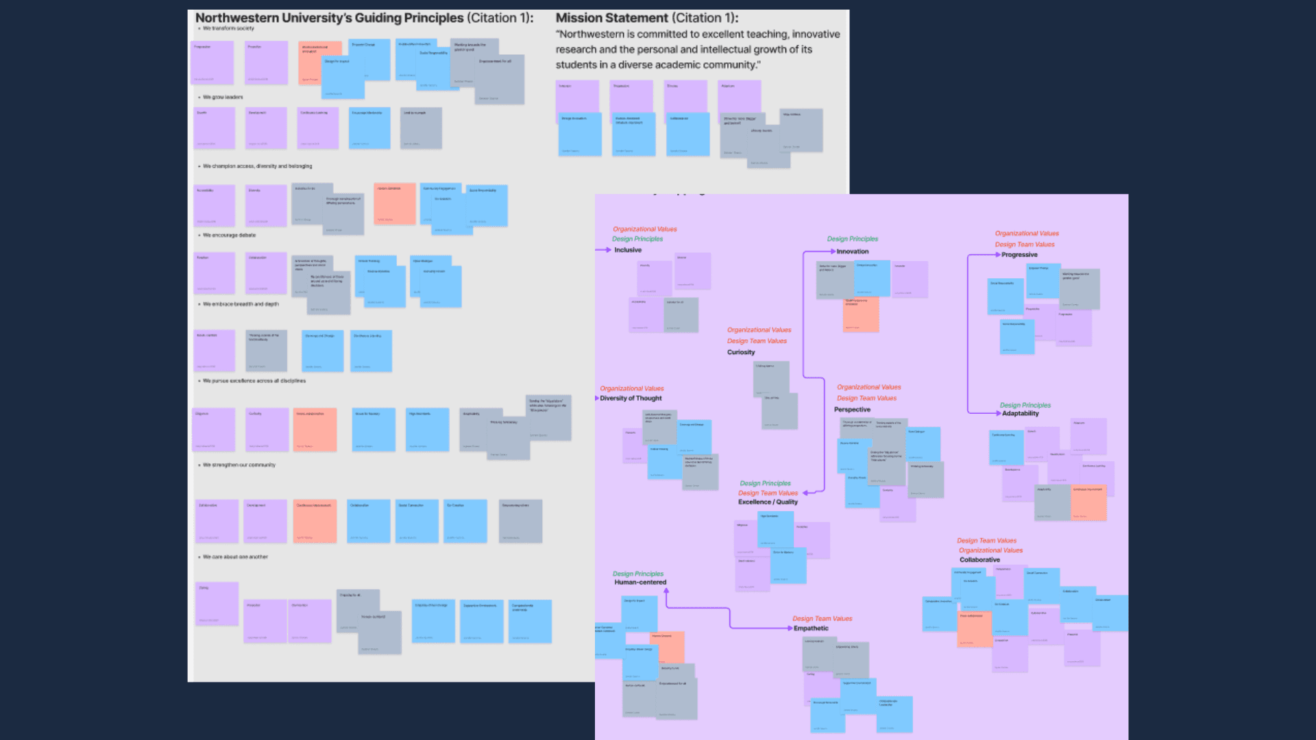
guiding principles
To ensure consistency without rigidity, we defined principles rooted in Northwestern’s values and refined through affinity mapping:
Fresh: Innovate when it adds clarity and impact, using research-driven methods
Feedback-Driven: Center student, staff, and alumni voices through iteration
Straightforward & Action-Oriented: Make information accessible, navigable, and usable
These principles served as a decision filter across systems, components, and communication.
hybrid design structure
Northwestern’s decentralized reality required flexibility. We proposed a hybrid model:
Centralized Team: Governance, system ownership, innovation, and standards
Embedded Designers: Aligned with high-engagement departments (e.g., Kellogg, McCormick) while adhering to shared foundations
Fluid Collaboration: Researchers, designers, and coordinators moving across discovery, prototyping, and delivery
This approach supports scale without sacrificing context.
career ladder & sustainability
To ensure longevity, we defined a growth framework:
Entry-Level: Build foundations (including Segal interns)
Mid-Level: Lead complex work and mentor
Senior-Level: Drive strategy and large initiatives
Management: Oversee teams and operations
Design Director: Align vision with Northwestern’s mission
Core competencies included user-centered design, collaboration, technical proficiency, and operational efficiency—creating a pipeline of future leaders.

↦ grounding in reality
auditing the existing ecosystem
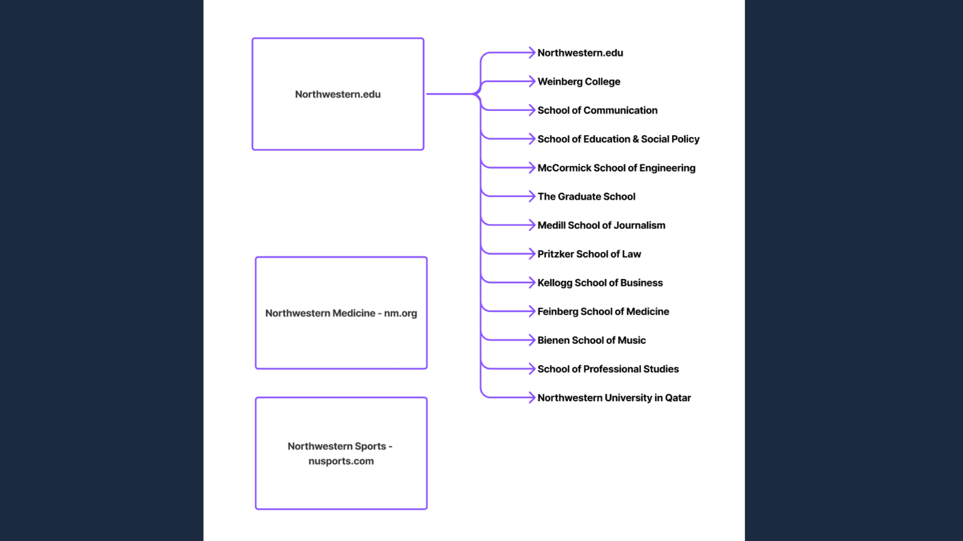
We conducted a comparative audit of Northwestern’s Home and Admissions pages, evaluating layouts, calls-to-action, buttons, branding, and accessibility.
Key Findings:
Inconsistent layouts disrupted navigation
Visual inconsistencies diluted brand recognition
Accessibility gaps risked excluding users
We mapped these findings across 12 colleges, Northwestern Medicine, and Athletics. While shared elements existed, inconsistent application created fragmentation.
These insights became the basis for system priorities—ensuring foundations addressed real, not theoretical, problems.
↦ system foundations
We began with the essentials—the core building blocks of a design system—to bring consistency, accessibility, and cohesion to Northwestern’s digital presence.
color
Framer is a no-code tool for building and publishing responsive websites—perfect for anyone creating modern, high-performance pages without coding.
typography & spacing
Framer is fully visual with no code needed, but you can still add custom code and components for more control if you're a designer or developer.
rounded corners
This is a free, responsive FAQ section for Framer. Drop it into any project, customize styles and text, and use it to save time on support or info pages.
iconography
After duplicating, copy and paste the component into your Framer project. Then edit the questions, answers, styles, and animations as needed.
graphic elements
Yes, absolutely. The component is built using native Framer tools, so you can tweak fonts, colors, spacing, animations, and layout however you like.
error state & 404
Yes, the FAQ component is fully responsive and adapts seamlessly to desktop, tablet, and mobile screen sizes.
↦ designing resuable components
from inconsistency to clarity
Early component reviews surfaced misaligned spacing, unclear labels, and missing states. The updated library introduced:
Clear documentation
Responsive behaviors
State indicators
Real-world examples
One-component-per-page Figma structure
key components
Framer is a no-code tool for building and publishing responsive websites—perfect for anyone creating modern, high-performance pages without coding.
technical handoff
Framer is fully visual with no code needed, but you can still add custom code and components for more control if you're a designer or developer.
↦ adoption and
alignment
a system only works if people use it
A design system only succeeds if it’s adopted. For NUDC, this meant going beyond documentation to create a communication plan that educates, supports, and engages stakeholders. Our plan focused on three goals:
Implementation: Consistent adoption
Relationships: Ongoing stakeholder trust
Clarity: Reduced friction in design processes

stakeholders
Schools (McCormick, Kellogg, Weinberg, Feinberg) and roles including designers, developers, marketers, administrators, and collaborators.
engagement strategies
Onboarding: Standardized training
Ongoing Updates: Monthly digests, version notes
Touchpoints: Workshops, town halls, testing, success stories
This strategy transforms communication from a one-time rollout into a continuous feedback loop. By building awareness, trust, and shared value in design, NUDC positions itself not just as a toolkit, but as a long-term partner across Northwestern.
↦ reflection
designing for maturity over time
Early success looks like engagement, adoption, and actionable feedback. Long-term success means design becomes a shared competency—embedded early, practiced broadly, and tied to decision-making.
Looking forward, NUDC provides:
clear branding and standards
consistent, accessible user experiences
stronger collaboration across the university
Ultimately, NUDC is more than components—it’s a framework for cultural change. Grounded in research, principles, and adoption, it lays the foundation for a sustainable, people-first design practice at Northwestern.